In this update4
Full notes
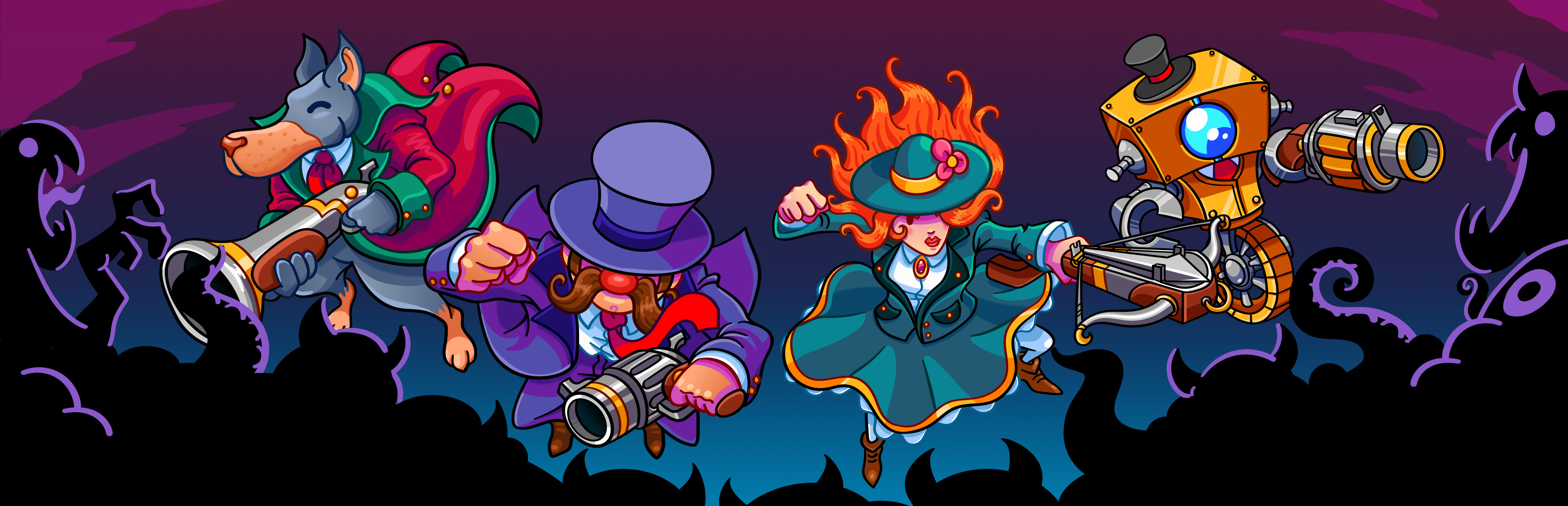
Full Monsters and Monocles update
Read the full published notes in a cleaner layout. The original post stays linked below.
What changed
- UI and audio
- Balance
- Gameplay
- Server
Monsters and Monocles changes
Hi everyone,
As mentioned in the previous couple of updates, these past few months have been all about working through and finishing every aspect of the game's UI. We're happy to report that we managed to hit our goal this past month, and have now started working on wrapping up all of the game's supporting UX work and general connective tissue. This should really help round out the overall game-flow and make the game feel like a more complete experience.
Here's a rundown of some of the new UI work:
Game Title Screen
It being the first screen a player sees, I wanted to add a bit more detail and general polish to the game's title, as well as adding a few subtle animations to breath a bit of life into it.
Codex Screen
Since the airship's codex computer is so detached from the rest of the game UI, I wanted to try something more unique and thematic, so I decided to make it a more detailed representation of the actual in-game console sprite.
Relic Screens
Trying to come up with a clear and easy to use screen for equipping/upgrading relics, that also works in single player, local MP, and online MP has always been a bit challenging. After testing a few ideas and different approaches, we decided it would be best to split equipping and upgrading into two distinct screens
The equip relics console is all about selecting the relics you want from the ones available, with the new central grid view showing you which relics still need to be discovered
Having relic upgrades be a unique screen helps remove some of the UI complexity and visual clutter, and makes it a distinct action.
Game Over Screens
For the game over screen, it became clear that the key information a player would want after a solo run, would be fairly different from that of a MP group. With that in mind, we decided to take a unique approach for each.
In single player, all items, relics, and weapons collected on that run are now tracked and shown.
In multiplayer, a crown is awarded to the each player for least deaths, most kills, and most gold collected. (It looks like our heroes have seen better days T_T)
Although it's been quite the task working through an entire game's worth of UI, we're really happy with how everything is coming together, and are in a good place to finish up all of the remaining UX work needed to bring us closer to having a fully fleshed out game. Once that core foundation is done, we'll then be able to push ahead with the remaining content, and all of the fun stuff that entails :)
Thank you for reading, and please stay safe and take care of yourselves.
Craig
Source
Changelog.gg summarizes and formats this update. How we read updates.