
In this update3
Full notes
Full MoteMancer update
Read the full published notes in a cleaner layout. The original post stays linked below.
What changed
- UI and audio
- Maps
- Gameplay
MoteMancer changes
I received a very fair critique from multiple sources:
If your game is all hexagons, why are you using that tired old rectangle selector for blueprints?
I love this kind of feedback because it points directly at one of the most important north stars in any creative work: immersion.
A longer way to say it is that everything in your game should tell the same story. In MoteMancer that shows up everywhere: 6 Elements, 6 Planes, 6-sided cells, 6 keybinds on either side of center, 6 recipes per structure. As much as possible, every part of the experience should rhyme with itself.
And it's not just for aesthetics (even if that's a nice perk), it’s about building a world that plays by its own rules. When that holds, players start thinking within the system instead of translating it back into something familiar. That’s where immersion really takes hold.
So when people tell me to get those squares outta here, they’re absolutely right.
Blueprint Footprints
Because MoteMancer’s hex-grid language takes time to internalize, players naturally start by building in straight lines, even if they are diagonal. Over time that shifts toward more radial designs that take advantage of adjacency, and eventually into more expressive, mandala-like layouts.
Each of those stages is valid.
It's super important to recognize that players will live in all of these stages though, so changing the blueprint system to something specific is not the best solution. We can instead offer a tool for each stage of familiarity. To that end, Blueprints now have 3 selection modes: Rectangular, Diamond, and Radial. You can swap between them with X, the same way you swap between freeform and locked belt placement.
Note that Diamond mode is basically a freeform parallelogram, and works in all 6 directions, long corner to long corner.
Return of the Map
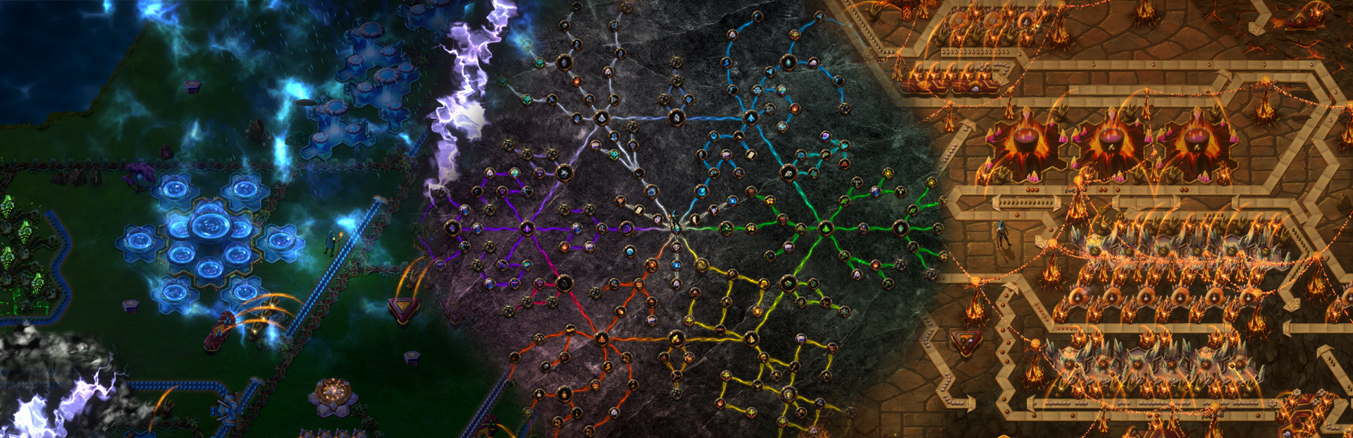
Back when the Map feature first found its way into the game, it used a clever technique of offsetting every other row by half a pixel (yes I know that's not a thing) to achieve the offset look. Honestly that was pretty successful, but as I was wrapping that up I realized a way to actually get hexagonal pixels on the map, it just takes a little clever uv-math hijacking.
For anyone unfamiliar, UVs are just coordinates that tell the renderer which part of a texture to sample. Normally you map a square UV to a square texture and call it a day, but the system doesn’t really care what values you feed it, it just performs the lookup.
In the simple case, we can reduce the UV texture to a small 32x32 and just used those values to correspond to the grid coordinate which gave us a very nice pixelated grid vibe. From there, it’s just a step further to define hex-shaped regions that all point to the same UV coordinate. The result is a map made of true hex “pixels,” even though under the hood it’s still just sampling a texture.
Sanding off the Correct Edges
There will always be rough edges in any system, and not all of them should be removed.
Some edges create space for player creativity. They invite clever solutions, unexpected patterns, and a sense of discovery. Those are worth preserving.
The edges that need attention are the ones that break the internal logic of the world. When something feels out of place, it pulls players out of the experience.
Replacing rectangular blueprint selection and reinforcing the hex language across the map are both examples of sanding down those kinds of edges. They don’t change what the game is, they make it feel more like itself.
Happy 50th Musing! Thanks to everyone who’s been part of the journey so far. We’re firmly in the downhill stretch now, and the focus is on refining the experience and removing the friction that breaks immersion in your alchemical gardens.
Back to the lab! 🌿 ~CyanAvatar
Source
Changelog.gg summarizes and formats this update. How we read updates.