
HomeGamesUpdatesPricingMethodology
Steam News15 August 20241y ago

We'd like your input on the HUD design

As we continue to refine the user interface for Middle Ages: Peasants & Knights, we've come to a crossroads regarding the display of player attributes in the main HUD.

Full notes

Full Middle Ages: Peasants & Knights update

Read the full published notes in a cleaner layout. The original post stays linked below.

What changed

0 fixes0 additions2 changes0 removals
  • UI and audio
  • Balance
changedAs we continue to refine the user interface for Middle Ages: Peasants & Knights, we've come to a crossroads regarding the display of player attributes in the main HUD. We’d like to hear your thoughts on two design options we're considering.
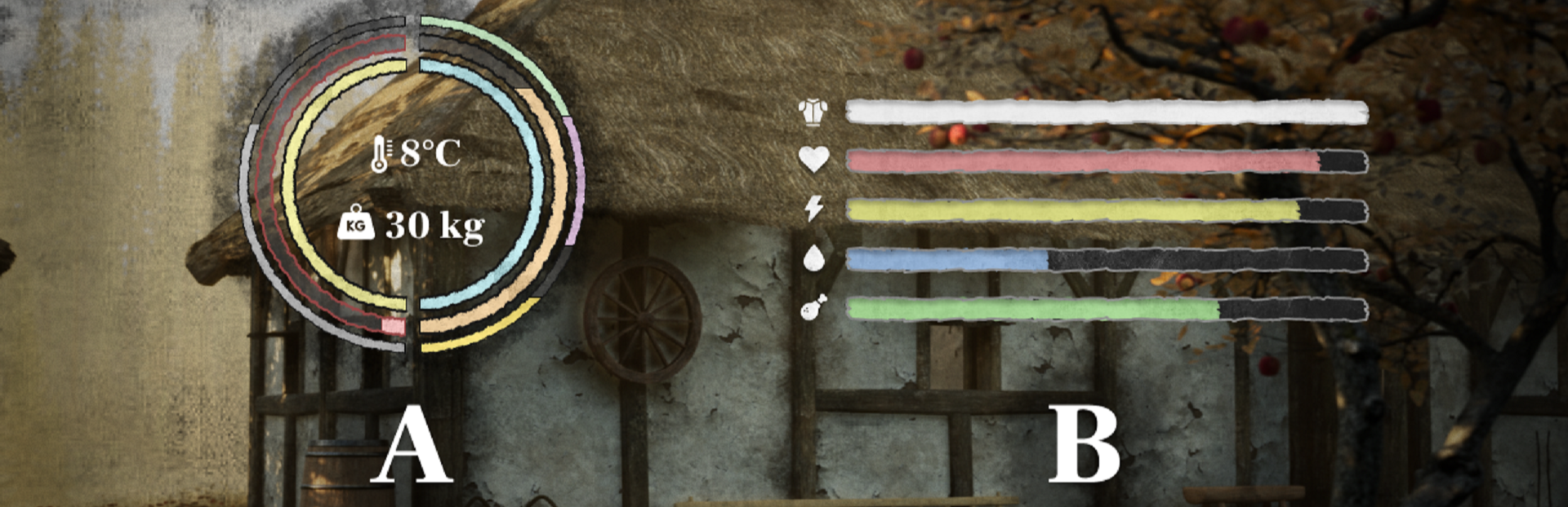
changedOption A: The Circular Approach This compact design incorporates all important player attributes into a single, unified circle. It displays Armor, Health, Stamina, Thirst, Hunger, as well as the other stats like Fiber, Protein, and Carbohydrates. Additionally, it integrates Weight and Temperature at the center. While it's a space-efficient solution, we recognize it may sacrifice some readability and its modern aesthetic might feel out of place.

Middle Ages: Peasants & Knights changes

changedAs we continue to refine the user interface for Middle Ages: Peasants & Knights, we've come to a crossroads regarding the display of player attributes in the main HUD. We’d like to hear your thoughts on two design options we're considering.
changedOption A: The Circular Approach This compact design incorporates all important player attributes into a single, unified circle. It displays Armor, Health, Stamina, Thirst, Hunger, as well as the other stats like Fiber, Protein, and Carbohydrates. Additionally, it integrates Weight and Temperature at the center. While it's a space-efficient solution, we recognize it may sacrifice some readability and its modern aesthetic might feel out of place.

As we continue to refine the user interface for Middle Ages: Peasants & Knights, we've come to a crossroads regarding the display of player attributes in the main HUD. We’d like to hear your thoughts on two design options we're considering.

Option A: The Circular Approach This compact design incorporates all important player attributes into a single, unified circle. It displays Armor, Health, Stamina, Thirst, Hunger, as well as the other stats like Fiber, Protein, and Carbohydrates. Additionally, it integrates Weight and Temperature at the center. While it's a space-efficient solution, we recognize it may sacrifice some readability and its modern aesthetic might feel out of place.

Option B: The Linear Bars This more traditional layout offers better readability with a series of straight bars and is perhaps more fitting with the medieval theme. However, it comes at the cost of screen space and omits some of the finer details like nutritional breakdown, weight, and temperature.

Both designs have their merits, and that's why we decided to ask you all! Do you prefer the comprehensive data of the circular design, or the clarity and thematic consistency of the linear bars? Tell us in the comments.

Source

Steam News / 15 August 2024

Open original post

Changelog.gg summarizes and formats this update. How we read updates.