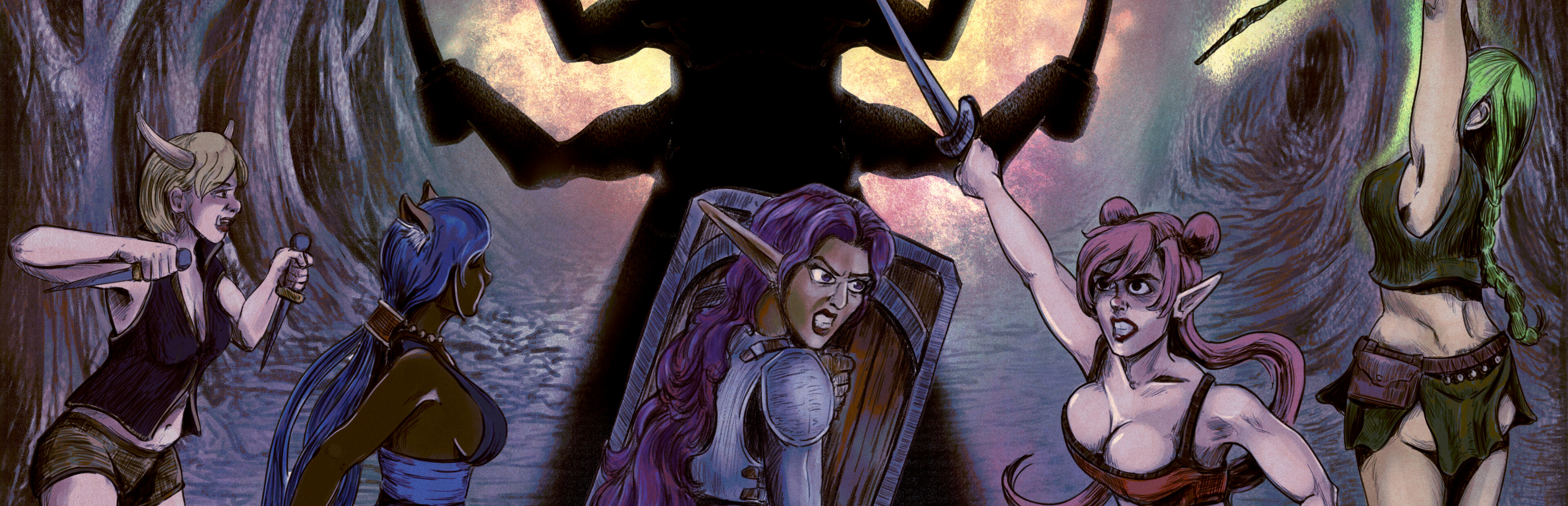
Developer Note: This month is the "Art Update" which includes the March as well. Since March was slim in terms of functionality, I feel it was necessary to "skip an update month" due to the work needed to redo the art.
Full notes
Full Fantasy Waifu Collector update
Read the full published notes in a cleaner layout. The original post stays linked below.
What changed
3 fixes6 additions6 changes0 removals
Gameplay
Fixes
Performance
Server
Store
Balance
changedDeveloper Note: This month is the "Art Update" which includes the March as well. Since March was slim in terms of functionality, I feel it was necessary to "skip an update month" due to the work needed to redo the art. Since that work couldn't be split up, it was easier to just release it all in one update. The reason that the art needed to be redone was to make it consistent across the entire game. Easier said than done...*crying noises*. All of the art assets were created over the span of 2 years, so redoing it all in 2 months was a very hefty chore. The focus was on redoing all of the major assets, specifically the backgrounds, character models, and game logo. Since I'm not practiced enough to make good looking backgrounds (obviously lol), I contracted an amazing artist, Talon to do them! Due to poor indie solo dev problems, I could only afford a few, so the work was split into phases, with the first just focused on the important high-priority ones. The lesser priority ones were replaced with "passable placeholders" until I can save up money to afford a proper "Phase 2". For the character models, that required redesigning them from scratch. Form and line-work to establish the model is the most important foundation, and it took me two weeks (with some vital help from "J") to get them made. The process starts with anatomically accurate proportions, then modifing them into stylized figures. After that, the work to build on top of them goes much faster. Thankfully, redoing everything into "flat" coloring is a very fast process; to compare, it took two weeks to just draw the base model, while it took two weeks to create all the coloring, features (eyes, ears, hair) and start on clothing. In redoing the eyes, I took this opportunity to separate them out into styling different "natures", which brings variety to the finished models. Then the clothes...so many of them! I had to just devote any free time I had to just grind them out. I redesigned a couple pieces to look better, and also added a couple new pieces during the process. For the game logo and title text involved using my graphic design degree instead of just the haphazard scribbling I did previously. I wanted a more brush-like, well, calligraphic-like styled typeface for the "Fantasy Waifu", with a bold and heavy typeface for the "Collector". I wanted a purposeful distinct style between each. I just could not find a good fit for "Fantasy Waifu", plus I wanted to replace the "t" with a sword, and dot the "i" with a heart. A majority of calligraphic typefaces are closer to cursive, with big curvy strokes and fancy twirls; elements that reduce legibility when used at small-scale such at 8pt. It became quickly apparent that I needed a custom font for this; breaking into my aforementioned Graphic Design knowledge, I worked on determining the elements for the typeface itself. I wanted the brush-curves, however I wanted solid, straight lines as well. Sitting down to design this, I sketched out the forms of the letters, then went over them with vertical straight lines with curved horizontal strokes. Serifs would only be where "the brush starts", while sans-serif on the "pen" strokes. I posted the drafts for review with collegues, and made refinements from there, adding in straight movements for the diagonal lines as well. Kerning is always tricky, where it's easy to just mathematically space lettering, that doesn't always translate well to what the eye sees, especially due to letter weights and over-hanging lines. Finally, with an all-black SVG, the font is tested for legibility across scaling. I ended up with a much cleaner font that a couple reviewers commented that I should make a proper typeface out of this! Future work, yay. Then, for "Collector", I had liked the use from the old logo text, simply using "Arial Black" which thankfully can be used for commercial purposes in a logo (I'm using a commercial version of Win11 btw!). Honestly, as one of the "default" fonts, Arial is quite over-exposed. However, using it for bold logo text, it provided me the weight I wanted. Putting both parts together, they were tested as all-black on white, scaled, placed, and fitted; passing all tests. For instance, if it can't be read as a tiny black text on white, then it needs more work. Only when the font itself is complete then effects can be added. Using the redone, formalized palette I had to do, I kept the same color gradients in "Collector", however went for a lighter, more subtle gradient for "Fantasy Waifu", with thin yet solid black line-work. See? That's how much work goes into something as "simple" as logo text! Then, for the game logo itself, instead of the pixel-art bright-haired anime-girl-face, I had to redesign that as a better looking logo. Similar gacha games in the genre all use a stereotypical "anime waifu face", so I redid the logo following the same suit. Considering I now had 2 years more of art experience in this style, reworking the head easier, there were plenty of references to get inspiration from. At this point in my "art career" (lol), I'm confident in how I do "anime" eyes; I think I have a solid recipe to work from (that's why I redid the different "nature" eyes in the first place). I wanted to keep the same hairstyle, pony-tail with hair tie, and retain the same coloring where I could. Since I had a proper palette this time, I used all the colors from there; that pink hair had to go! While I could have stuck with 1-flat color, I decided to go ahead and do shade and highlight (3-color "flat" style), especially since this is a logo, it needs a little bit of "extra" in it, right!? For the background, not only do I have a transparent version, but I wanted to carry-over the color gradient used in the logo text as well, pulling colors from both gradients. I was very stressed and worried this entire time, however as the art was completed and put into the game, it quickly became apparent that the result was worth the cost. All that said, the game looks so much better! Maybe even sellable! Please be sellable!
fixedBugfix:
fixedFixed Catball controls; Note that if your character is "moving slow" then you need to invest into Agility #userproblem
changedWSurvivor: Fix Crystal store crash
fixedChanged Daily Reset to UTC; fixed server sync reset issues and rewards
changedOptimized animated character drawing; increases up to 5fps (per character?)
Fantasy Waifu Collector changes
changedDeveloper Note: This month is the "Art Update" which includes the March as well. Since March was slim in terms of functionality, I feel it was necessary to "skip an update month" due to the work needed to redo the art. Since that work couldn't be split up, it was easier to just release it all in one update. The reason that the art needed to be redone was to make it consistent across the entire game. Easier said than done...*crying noises*. All of the art assets were created over the span of 2 years, so redoing it all in 2 months was a very hefty chore. The focus was on redoing all of the major assets, specifically the backgrounds, character models, and game logo. Since I'm not practiced enough to make good looking backgrounds (obviously lol), I contracted an amazing artist, Talon to do them! Due to poor indie solo dev problems, I could only afford a few, so the work was split into phases, with the first just focused on the important high-priority ones. The lesser priority ones were replaced with "passable placeholders" until I can save up money to afford a proper "Phase 2". For the character models, that required redesigning them from scratch. Form and line-work to establish the model is the most important foundation, and it took me two weeks (with some vital help from "J") to get them made. The process starts with anatomically accurate proportions, then modifing them into stylized figures. After that, the work to build on top of them goes much faster. Thankfully, redoing everything into "flat" coloring is a very fast process; to compare, it took two weeks to just draw the base model, while it took two weeks to create all the coloring, features (eyes, ears, hair) and start on clothing. In redoing the eyes, I took this opportunity to separate them out into styling different "natures", which brings variety to the finished models. Then the clothes...so many of them! I had to just devote any free time I had to just grind them out. I redesigned a couple pieces to look better, and also added a couple new pieces during the process. For the game logo and title text involved using my graphic design degree instead of just the haphazard scribbling I did previously. I wanted a more brush-like, well, calligraphic-like styled typeface for the "Fantasy Waifu", with a bold and heavy typeface for the "Collector". I wanted a purposeful distinct style between each. I just could not find a good fit for "Fantasy Waifu", plus I wanted to replace the "t" with a sword, and dot the "i" with a heart. A majority of calligraphic typefaces are closer to cursive, with big curvy strokes and fancy twirls; elements that reduce legibility when used at small-scale such at 8pt. It became quickly apparent that I needed a custom font for this; breaking into my aforementioned Graphic Design knowledge, I worked on determining the elements for the typeface itself. I wanted the brush-curves, however I wanted solid, straight lines as well. Sitting down to design this, I sketched out the forms of the letters, then went over them with vertical straight lines with curved horizontal strokes. Serifs would only be where "the brush starts", while sans-serif on the "pen" strokes. I posted the drafts for review with collegues, and made refinements from there, adding in straight movements for the diagonal lines as well. Kerning is always tricky, where it's easy to just mathematically space lettering, that doesn't always translate well to what the eye sees, especially due to letter weights and over-hanging lines. Finally, with an all-black SVG, the font is tested for legibility across scaling. I ended up with a much cleaner font that a couple reviewers commented that I should make a proper typeface out of this! Future work, yay. Then, for "Collector", I had liked the use from the old logo text, simply using "Arial Black" which thankfully can be used for commercial purposes in a logo (I'm using a commercial version of Win11 btw!). Honestly, as one of the "default" fonts, Arial is quite over-exposed. However, using it for bold logo text, it provided me the weight I wanted. Putting both parts together, they were tested as all-black on white, scaled, placed, and fitted; passing all tests. For instance, if it can't be read as a tiny black text on white, then it needs more work. Only when the font itself is complete then effects can be added. Using the redone, formalized palette I had to do, I kept the same color gradients in "Collector", however went for a lighter, more subtle gradient for "Fantasy Waifu", with thin yet solid black line-work. See? That's how much work goes into something as "simple" as logo text! Then, for the game logo itself, instead of the pixel-art bright-haired anime-girl-face, I had to redesign that as a better looking logo. Similar gacha games in the genre all use a stereotypical "anime waifu face", so I redid the logo following the same suit. Considering I now had 2 years more of art experience in this style, reworking the head easier, there were plenty of references to get inspiration from. At this point in my "art career" (lol), I'm confident in how I do "anime" eyes; I think I have a solid recipe to work from (that's why I redid the different "nature" eyes in the first place). I wanted to keep the same hairstyle, pony-tail with hair tie, and retain the same coloring where I could. Since I had a proper palette this time, I used all the colors from there; that pink hair had to go! While I could have stuck with 1-flat color, I decided to go ahead and do shade and highlight (3-color "flat" style), especially since this is a logo, it needs a little bit of "extra" in it, right!? For the background, not only do I have a transparent version, but I wanted to carry-over the color gradient used in the logo text as well, pulling colors from both gradients. I was very stressed and worried this entire time, however as the art was completed and put into the game, it quickly became apparent that the result was worth the cost. All that said, the game looks so much better! Maybe even sellable! Please be sellable!
fixedBugfix:
fixedFixed Catball controls; Note that if your character is "moving slow" then you need to invest into Agility #userproblem
changedWSurvivor: Fix Crystal store crash
fixedChanged Daily Reset to UTC; fixed server sync reset issues and rewards
Developer Note: This month is the "Art Update" which includes the March as well. Since March was slim in terms of functionality, I feel it was necessary to "skip an update month" due to the work needed to redo the art. Since that work couldn't be split up, it was easier to just release it all in one update. The reason that the art needed to be redone was to make it consistent across the entire game. Easier said than done...*crying noises*. All of the art assets were created over the span of 2 years, so redoing it all in 2 months was a very hefty chore. The focus was on redoing all of the major assets, specifically the backgrounds, character models, and game logo. Since I'm not practiced enough to make good looking backgrounds (obviously lol), I contracted an amazing artist, Talon to do them! Due to poor indie solo dev problems, I could only afford a few, so the work was split into phases, with the first just focused on the important high-priority ones. The lesser priority ones were replaced with "passable placeholders" until I can save up money to afford a proper "Phase 2". For the character models, that required redesigning them from scratch. Form and line-work to establish the model is the most important foundation, and it took me two weeks (with some vital help from "J") to get them made. The process starts with anatomically accurate proportions, then modifing them into stylized figures. After that, the work to build on top of them goes much faster. Thankfully, redoing everything into "flat" coloring is a very fast process; to compare, it took two weeks to just draw the base model, while it took two weeks to create all the coloring, features (eyes, ears, hair) and start on clothing. In redoing the eyes, I took this opportunity to separate them out into styling different "natures", which brings variety to the finished models. Then the clothes...so many of them! I had to just devote any free time I had to just grind them out. I redesigned a couple pieces to look better, and also added a couple new pieces during the process. For the game logo and title text involved using my graphic design degree instead of just the haphazard scribbling I did previously. I wanted a more brush-like, well, calligraphic-like styled typeface for the "Fantasy Waifu", with a bold and heavy typeface for the "Collector". I wanted a purposeful distinct style between each. I just could not find a good fit for "Fantasy Waifu", plus I wanted to replace the "t" with a sword, and dot the "i" with a heart. A majority of calligraphic typefaces are closer to cursive, with big curvy strokes and fancy twirls; elements that reduce legibility when used at small-scale such at 8pt. It became quickly apparent that I needed a custom font for this; breaking into my aforementioned Graphic Design knowledge, I worked on determining the elements for the typeface itself. I wanted the brush-curves, however I wanted solid, straight lines as well. Sitting down to design this, I sketched out the forms of the letters, then went over them with vertical straight lines with curved horizontal strokes. Serifs would only be where "the brush starts", while sans-serif on the "pen" strokes. I posted the drafts for review with collegues, and made refinements from there, adding in straight movements for the diagonal lines as well. Kerning is always tricky, where it's easy to just mathematically space lettering, that doesn't always translate well to what the eye sees, especially due to letter weights and over-hanging lines. Finally, with an all-black SVG, the font is tested for legibility across scaling. I ended up with a much cleaner font that a couple reviewers commented that I should make a proper typeface out of this! Future work, yay. Then, for "Collector", I had liked the use from the old logo text, simply using "Arial Black" which thankfully can be used for commercial purposes in a logo (I'm using a commercial version of Win11 btw!). Honestly, as one of the "default" fonts, Arial is quite over-exposed. However, using it for bold logo text, it provided me the weight I wanted. Putting both parts together, they were tested as all-black on white, scaled, placed, and fitted; passing all tests. For instance, if it can't be read as a tiny black text on white, then it needs more work. Only when the font itself is complete then effects can be added. Using the redone, formalized palette I had to do, I kept the same color gradients in "Collector", however went for a lighter, more subtle gradient for "Fantasy Waifu", with thin yet solid black line-work. See? That's how much work goes into something as "simple" as logo text! Then, for the game logo itself, instead of the pixel-art bright-haired anime-girl-face, I had to redesign that as a better looking logo. Similar gacha games in the genre all use a stereotypical "anime waifu face", so I redid the logo following the same suit. Considering I now had 2 years more of art experience in this style, reworking the head easier, there were plenty of references to get inspiration from. At this point in my "art career" (lol), I'm confident in how I do "anime" eyes; I think I have a solid recipe to work from (that's why I redid the different "nature" eyes in the first place). I wanted to keep the same hairstyle, pony-tail with hair tie, and retain the same coloring where I could. Since I had a proper palette this time, I used all the colors from there; that pink hair had to go! While I could have stuck with 1-flat color, I decided to go ahead and do shade and highlight (3-color "flat" style), especially since this is a logo, it needs a little bit of "extra" in it, right!? For the background, not only do I have a transparent version, but I wanted to carry-over the color gradient used in the logo text as well, pulling colors from both gradients. I was very stressed and worried this entire time, however as the art was completed and put into the game, it quickly became apparent that the result was worth the cost. All that said, the game looks so much better! Maybe even sellable! Please be sellable!
Bugfix:
Fixed Catball controls; Note that if your character is "moving slow" then you need to invest into Agility #userproblem
WSurvivor: Fix Crystal store crash
Changed Daily Reset to UTC; fixed server sync reset issues and rewards
Optimized animated character drawing; increases up to 5fps (per character?)
Time conversion to UTC crashed if negative seconds
New:
New background art! Redone character and clothings art! Redone game logo and text! New art [almost] everwhere!
Changed story to support Storybook style characters
AddedStorybookAdded SquadLeader, replaces Goddess of Dragons for some tutorials and better story flow
Upon completing "Basic Training", the player will receive the "Squad Leader", who is a Stone-Nature character with Taunt. All stats are randomized.
AdjustedUrgent QuestLowered Ratmin King & Ratmin heath, and swapped skills
Added more skin tones for dolls
Added "gobbo" ears for dolls
Added to Feline: Body Suit and Leggings
"Squad Leader" equipped with plot armor for story reasons, can't use to make a Skill book or as Star-up
AdjustedGacha CastleChanged sort order of banners by importance