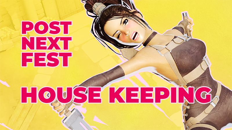
Hello! The dust from Next Fest has settled and afaic this thing should be on 365 days a year because many played the demo and wishlisted DAWN ONE, which is amazing!
Full notes
Full DAWN ONE update
Read the full published notes in a cleaner layout. The original post stays linked below.
Repeated intro
Hello! The dust from Next Fest has settled and afaic this thing should be on 365 days a year because many played the demo and wishlisted DAWN ONE, which is amazing! Some people sent feedback and I'm eternally grateful for that. So here's what changed recently:
What changed
0 fixes2 additions3 changes0 removals
Gameplay
UI and audio
Performance
Balance
changedHello! The dust from Next Fest has settled and afaic this thing should be on 365 days a year because many played the demo and wishlisted DAWN ONE, which is amazing! Some people sent feedback and I'm eternally grateful for that. So here's what changed recently:
addedAdded a user interface readability option (new "UI Contrast" button in the main and pause menu) for people struggling with the everything red style. This should make text more comfortable to read and other UI elements clearer. With this option on, UI is white at night and black during the day.
changedRadically reduced the mouse cursor deadzone, so basic movement is a lot sharper and precise (which I love!! Amazing feedback thank you so much @shuandang on twitter)
changedI am mostly concentrating on the full game so that's pretty much it for the demo, besides GPU optimization on post-process nobody asked for, but I did it anyway.
addedAnother takeaway from Next Fest: the capsule art didn't do its job. Once people are on the store page and/or try the demo, the chances of them wishlisting are pretty high, but nobody clicked the bloody capsule in the first place! So I decided to rebrand everything, improve key art, make things brighter and (hopefully) catchier, I also updated the game's logo and propagated it in-game with motion graphics when surviving a night, for the game over screen (that's no longer confirm-able and now leads to a new session automatically), and other areas where the logo appears.
DAWN ONE changes
changedHello! The dust from Next Fest has settled and afaic this thing should be on 365 days a year because many played the demo and wishlisted DAWN ONE, which is amazing! Some people sent feedback and I'm eternally grateful for that. So here's what changed recently:
addedAdded a user interface readability option (new "UI Contrast" button in the main and pause menu) for people struggling with the everything red style. This should make text more comfortable to read and other UI elements clearer. With this option on, UI is white at night and black during the day.
changedRadically reduced the mouse cursor deadzone, so basic movement is a lot sharper and precise (which I love!! Amazing feedback thank you so much @shuandang on twitter)
changedI am mostly concentrating on the full game so that's pretty much it for the demo, besides GPU optimization on post-process nobody asked for, but I did it anyway.
addedAnother takeaway from Next Fest: the capsule art didn't do its job. Once people are on the store page and/or try the demo, the chances of them wishlisting are pretty high, but nobody clicked the bloody capsule in the first place! So I decided to rebrand everything, improve key art, make things brighter and (hopefully) catchier, I also updated the game's logo and propagated it in-game with motion graphics when surviving a night, for the game over screen (that's no longer confirm-able and now leads to a new session automatically), and other areas where the logo appears.
Added a user interface readability option (new "UI Contrast" button in the main and pause menu) for people struggling with the everything red style. This should make text more comfortable to read and other UI elements clearer. With this option on, UI is white at night and black during the day.
Radically reduced the mouse cursor deadzone, so basic movement is a lot sharper and precise (which I love!! Amazing feedback thank you so much @shuandang on twitter)
I am mostly concentrating on the full game so that's pretty much it for the demo, besides GPU optimization on post-process nobody asked for, but I did it anyway.
Another takeaway from Next Fest: the capsule art didn't do its job. Once people are on the store page and/or try the demo, the chances of them wishlisting are pretty high, but nobody clicked the bloody capsule in the first place! So I decided to rebrand everything, improve key art, make things brighter and (hopefully) catchier, I also updated the game's logo and propagated it in-game with motion graphics when surviving a night, for the game over screen (that's no longer confirm-able and now leads to a new session automatically), and other areas where the logo appears.
It may seem superficial (and it is) but visibility is lifeblood, specially for a game that doesn't adhere to modern game design conventions and it would be stupid to miss out because of dull key art.