
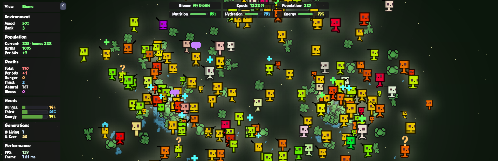
In this update4
Full notes
Full The Neeblarium update
Read the full published notes in a cleaner layout. The original post stays linked below.
What changed
- UI and audio
- Gameplay
The Neeblarium changes
This update is all about making the Neeblarium easier to read, easier to use, and easier to understand —especially as the engineering, blueprint, and achievement systems deepen.
Nothing flashy. Just meaningful polish where it matters.
🛠️ Clearer Tools, Better Feedback
Several core tools and panels now communicate their state more clearly:
Engineering tools now appear consistently in the tool palette when unlocked
Section headers and icons in the Engineering Panel have been refined for readability
Tool icons and UI assets have been refreshed to better match the current visual language
You should spend less time guessing why something is unavailable—and more time deciding what to do next.
🧬 Blueprint & Lab UX Improvements
Working with blueprints and extractions is now more transparent:
Extraction buttons explain why an action is blocked, directly in the UI
Tooltips have been simplified and rewritten for clarity
Lab views now prioritize lifecycle phase over ambiguous status labels
The lab should feel like a place of understanding, not friction.
🏆 Achievement & Progression Tuning
Progression systems continue to settle into place:
Achievement thresholds have been adjusted for better pacing
Steam achievement handling has been improved and stabilized
Badge logic has been cleaned up to avoid misleading signals
Your progress should now feel more intentional—and more reliably tracked.
🎨 Visual & UI Polish
A handful of smaller but important refinements landed in this build:
Updated UI icons and assets across multiple panels
Improved section spacing and hierarchy
Reduced visual noise in status labels and tooltips
These changes don’t shout—but they add up.
Source
Changelog.gg summarizes and formats this update. How we read updates.