
In this update4
Full notes
Full Price for Freedom: Gold and Sand update
Read the full published notes in a cleaner layout. The original post stays linked below.
What changed
- UI and audio
- Gameplay
- Balance
Price for Freedom: Gold and Sand changes
Demo Build - 1.2
Gameplay:
Added help tooltips for minigames
Fish are now highlighted when they can be speared
Fishing hit zones adjusted (should be easier)
BugFixes:
Fixed gallery portrait bugs (Aya, Samara, Scylla, Osh'to)
Spear Wall caused a hang in animations
Some typos slipped through
Known Issues:
Blackfur Skull in voice vs Hide
A few voice lines are missing integration/need another pass
Spear Thrust tooltip does not unload
Dead entrance when exiting tunnels to the bottom left in the blackfur "chase" scene
This is at the cliff-side area where Aya is goaded towards the cliff. Going into the tunnels was opted out of and not written, but the tunnel was mistakenly left in. Proceed this quest to the cliff-side/ridge instead of entering the blackfur tunnels.
A small red line appears for some people on the anvil in the Ogre Tribe.
A small thank you.
We at Team Dead Deer would like to thank everyone for taking the time away from next fest to check out demo out while there are so many amazing project hitting the storefront all at once. Originally we planned to release into next fest, there was a lot of internal debate and gut instincts/feelings about it, but at the end of the day the smarter choice was to push a public demo before we declare into a Next Fest.
This was largely so we can get a greater spread of OS, hardware configs, and broader testing. This has allowed us to catch a few bugs on hardware configs, especially OS related, that we had no way of catching before. For bugs and issues in this regard, the bug reports have been invaluable.
General Feedback:
We have gotten a lot of generalised feedback not just on bugs, but on our content and features, and thank you all so much. This was a huge part of pushing a demo to steam on the 24th. We have gotten some amazing feedback based on our overhauled combat system, what works, what we are lacking, and what we might be able to add.
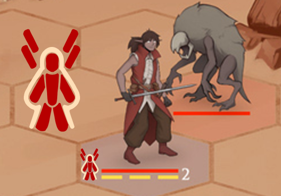
I have been pushing for readability for our combat systems for awhile, and feedback has reinforced that readability is in fact still an issue. The bars under enemies and friendlies, for instance, is not ergonomic. Its "efficient' and effective if you know what they mean, but do people know what it means without a tool-tip or a tutorial? No. So I pitched a paperdoll instead, which the team agreed with and we are pushing forward.
Other issues is that people are struggling on knowing when they can, or cannot, and WHY they cannot use abilities. We have it so if you mouse over the card you will see what is lacking... but this takes a hover over a thing which is not very ergonomic. The idea of adding gems that show the AP and Stamina cost for each ability on the card itself with no tool tip is our solution to this now! We are exploring other ideas
A gem with a number here, glowing when the player has enough resources for each ability and dimmed out when they do not, I feel, will address one of the issues. We are thinking of and keeping ideas on what to do and what can be improved to make the combat more readable, as we have gotten feedback that it is fun which is such a relief!
Again,t hank you all, and please stay tuned!
Source
Changelog.gg summarizes and formats this update. How we read updates.