Devblog - About the Interface from the Old Alpha Versions and the New Ones
How the character selection menu interface has evolved since the first alpha versions.
Full notes
Full Painted Legend: Knights of Ink & Paper update
Read the full published notes in a cleaner layout. The original post stays linked below.
What changed
0 fixes1 addition2 changes0 removals
UI and audio
changedHow the character selection menu interface has evolved since the first alpha versions.
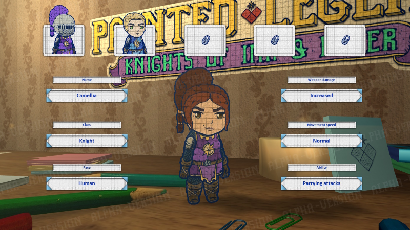
changedAt first, I wanted the interface to resemble the one from Painted Legend 2, where there was more information about the character and their abilities, and the character buttons were just pieces of paper with their names. However, I soon realized that the icons from the very first game were more colorful and appealing due to the portraits of the selectable characters. So, I decided to redesign the menu to include both the character icons and their abilities simultaneously.
addedEverything was great, but I still didn’t like how the portraits in the first game were very small, which wouldn’t work for the new game. So, I decided to split the character buttons into groups of 5 per page and allow scrolling left and right to fit larger portraits on the screen :)
Painted Legend: Knights of Ink & Paper changes
changedHow the character selection menu interface has evolved since the first alpha versions.
changedAt first, I wanted the interface to resemble the one from Painted Legend 2, where there was more information about the character and their abilities, and the character buttons were just pieces of paper with their names. However, I soon realized that the icons from the very first game were more colorful and appealing due to the portraits of the selectable characters. So, I decided to redesign the menu to include both the character icons and their abilities simultaneously.
addedEverything was great, but I still didn’t like how the portraits in the first game were very small, which wouldn’t work for the new game. So, I decided to split the character buttons into groups of 5 per page and allow scrolling left and right to fit larger portraits on the screen :)
How the character selection menu interface has evolved since the first alpha versions.
At first, I wanted the interface to resemble the one from Painted Legend 2, where there was more information about the character and their abilities, and the character buttons were just pieces of paper with their names. However, I soon realized that the icons from the very first game were more colorful and appealing due to the portraits of the selectable characters. So, I decided to redesign the menu to include both the character icons and their abilities simultaneously.
Everything was great, but I still didn’t like how the portraits in the first game were very small, which wouldn’t work for the new game. So, I decided to split the character buttons into groups of 5 per page and allow scrolling left and right to fit larger portraits on the screen :)