
Full notes
Full Gremlins, Inc. – Cards & Projects update
Read the full published notes in a cleaner layout. The original post stays linked below.
What changed
- UI and audio
- Gameplay
Gremlins, Inc. – Cards & Projects changes
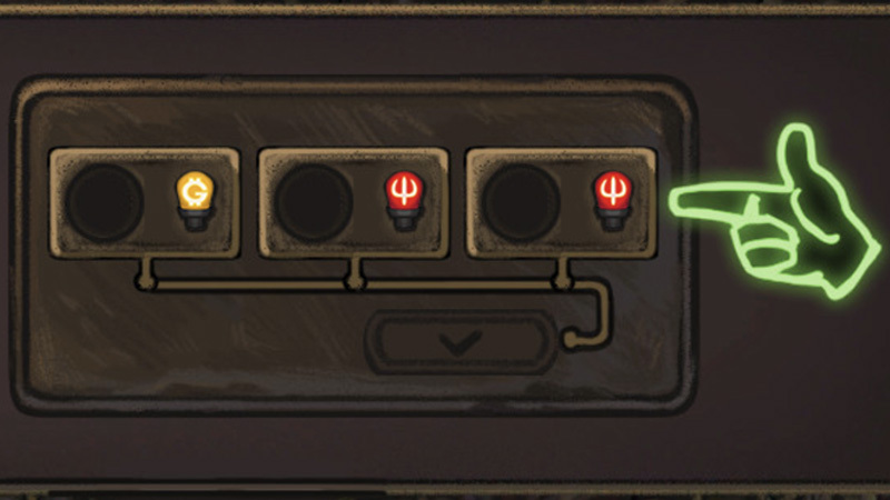
We have moved on to 146.1, and as you can see from the cover image, the area of focus is the pay-and-play user interface: making it "more tactile", more obvious.
Some elements are already in, and some are still a mess:
A few more SFX are in today's build, and work great.
We also spent a bit of time discussing the future mechanics, for the Early Access roadmap: permanent and instant cards, quests and item mechanics.
But back to reality: we expect a few more days of UI work, to say the least.
It's the small stuff that is evolving as we keep playing, and looking for ways to make the game's UI more obvious, easier to grasp.
For example, we used to have projects on the right side of the screen – just 3 project boxes, that's it.
Then we understood that if we would number them (1/2/3), it would make it easier to show, which card goes to which project. And thus we introduced project numbers.
Finally, this week we realized that if we differentiate them by color... then you would immediately realize, if you're assigning to your projects (good! green!) or to the opponent's (bad! red!), and so now the project IDs are with the color of the player (in the future, this will also help with the team UI).
We are looking forward to the moment when we can get this game (at least the demo/the playtest build) into your hands. Until then, more work is required.
Source
Changelog.gg summarizes and formats this update. How we read updates.