Hello everyone! This is PullUp. Today, let's talk about the updated capsule images. If you're a first-time indie game developer, take note.
Full notes
Full Fundoshinobi: The Naked Ninja update
Read the full published notes in a cleaner layout. The original post stays linked below.
Repeated intro
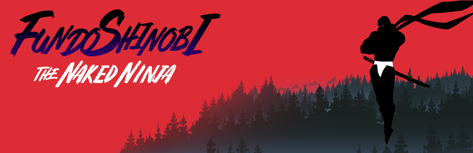
Hello everyone! This is PullUp. Today, let's talk about the updated capsule images. If you're a first-time indie game developer, take note. Capsule images are incredibly important — and the smaller the image, the more important it becomes. In a sea of so many games, if your capsule image can't catch a user's eye and earn that click, it doesn't matter how great your game is. Of course, many people discover and download games through other channels too, but that just goes to show how critical it really is. I didn't know that, though. So the very first capsule image I made was a mess. I just slapped together some existing images, and now they've all been overwritten — only one small capsule remains.
What changed
0 fixes3 additions1 change0 removals
Gameplay
Maps
Events
changedHello everyone! This is PullUp. Today, let's talk about the updated capsule images. If you're a first-time indie game developer, take note. Capsule images are incredibly important — and the smaller the image, the more important it becomes. In a sea of so many games, if your capsule image can't catch a user's eye and earn that click, it doesn't matter how great your game is. Of course, many people discover and download games through other channels too, but that just goes to show how critical it really is. I didn't know that, though. So the very first capsule image I made was a mess. I just slapped together some existing images, and now they've all been overwritten — only one small capsule remains.
addedIt was a capsule image with poor readability and no real effort put into it. Even so, there were kind souls who added the game to their wishlist back then. I'd like to take this opportunity to thank you once again. You're all angels. For the second version, I still used the original standing illustration, but improved readability. I went with a bold red solid background to make it pop, and since it's an adult game, I made the female character large and prominent. The protagonist got a fresh, icon-style redraw to fit in smaller.
addedI thought it wasn't bad, but I got feedback that the composition felt too formulaic — like it could pass for a mass-produced AI game. It was welcome feedback. The quality clearly needed a boost, and I'd been putting it off. For the new illustration, I planned the composition from scratch to fit the capsule image dimensions, trying to capture action, sexiness (within acceptable limits), and readability all at once. Since it ended up with a battle concept, the main female character role went to Ayame-chan, the boss of Stage 1. The protagonist Sho ends up looking like the villain.
addedAnd so, the main capsule and small capsule were unified under one design — giving us the new capsule image. Personally, I'm really happy with it. Since there's an event coming up soon, I'm planning to carve out some time to give the main page design a quality upgrade as well. When I first started developing the game, I only thought about making the game itself — but I've come to realize just how many other things need attention. I'm sure the next game will turn out even better. In any case, the most important thing to me right now is completing Fundoshinobi. Thank you all so much for your patience. See you in the next devlog!
Fundoshinobi: The Naked Ninja changes
changedHello everyone! This is PullUp. Today, let's talk about the updated capsule images. If you're a first-time indie game developer, take note. Capsule images are incredibly important — and the smaller the image, the more important it becomes. In a sea of so many games, if your capsule image can't catch a user's eye and earn that click, it doesn't matter how great your game is. Of course, many people discover and download games through other channels too, but that just goes to show how critical it really is. I didn't know that, though. So the very first capsule image I made was a mess. I just slapped together some existing images, and now they've all been overwritten — only one small capsule remains.
addedIt was a capsule image with poor readability and no real effort put into it. Even so, there were kind souls who added the game to their wishlist back then. I'd like to take this opportunity to thank you once again. You're all angels. For the second version, I still used the original standing illustration, but improved readability. I went with a bold red solid background to make it pop, and since it's an adult game, I made the female character large and prominent. The protagonist got a fresh, icon-style redraw to fit in smaller.
addedI thought it wasn't bad, but I got feedback that the composition felt too formulaic — like it could pass for a mass-produced AI game. It was welcome feedback. The quality clearly needed a boost, and I'd been putting it off. For the new illustration, I planned the composition from scratch to fit the capsule image dimensions, trying to capture action, sexiness (within acceptable limits), and readability all at once. Since it ended up with a battle concept, the main female character role went to Ayame-chan, the boss of Stage 1. The protagonist Sho ends up looking like the villain.
addedAnd so, the main capsule and small capsule were unified under one design — giving us the new capsule image. Personally, I'm really happy with it. Since there's an event coming up soon, I'm planning to carve out some time to give the main page design a quality upgrade as well. When I first started developing the game, I only thought about making the game itself — but I've come to realize just how many other things need attention. I'm sure the next game will turn out even better. In any case, the most important thing to me right now is completing Fundoshinobi. Thank you all so much for your patience. See you in the next devlog!
It was a capsule image with poor readability and no real effort put into it. Even so, there were kind souls who added the game to their wishlist back then. I'd like to take this opportunity to thank you once again. You're all angels. For the second version, I still used the original standing illustration, but improved readability. I went with a bold red solid background to make it pop, and since it's an adult game, I made the female character large and prominent. The protagonist got a fresh, icon-style redraw to fit in smaller.
I thought it wasn't bad, but I got feedback that the composition felt too formulaic — like it could pass for a mass-produced AI game. It was welcome feedback. The quality clearly needed a boost, and I'd been putting it off. For the new illustration, I planned the composition from scratch to fit the capsule image dimensions, trying to capture action, sexiness (within acceptable limits), and readability all at once. Since it ended up with a battle concept, the main female character role went to Ayame-chan, the boss of Stage 1. The protagonist Sho ends up looking like the villain.
And so, the main capsule and small capsule were unified under one design — giving us the new capsule image. Personally, I'm really happy with it. Since there's an event coming up soon, I'm planning to carve out some time to give the main page design a quality upgrade as well. When I first started developing the game, I only thought about making the game itself — but I've come to realize just how many other things need attention. I'm sure the next game will turn out even better. In any case, the most important thing to me right now is completing Fundoshinobi. Thank you all so much for your patience. See you in the next devlog!