
HomeGamesUpdatesPricingMethodology
Steam News15 August 20241y ago

DEV DIARY #5: Graphics and illustrations in Escape Tales: The Awakening

We’ve talked a little bit about the aesthetic vision while creating the demo in the Dev Diary #3, but today we’d like to fully focus on creating the images, graphics, and illustrations - basically every smaller and bigg

Full notes

Full Escape Tales: The Awakening update

Read the full published notes in a cleaner layout. The original post stays linked below.

What changed

0 fixes3 additions14 changes0 removals
  • Gameplay
  • Maps
  • UI and audio
changedNarrative Gameplay Although these elements are closely intertwined, their roles regarding the player are somewhat different. The first part introduces us to the story, provides context for the entire gameplay, and highlights the protagonist's motivations and fears. It tells the story of a father’s relationship with his daughter, his desperate attempts to save his child, and his longing for lost loved ones. 💔 To effectively convey these elements, we decided to enhance the text (adapted from the paragraphs in the paper version), with dedicated illustrations displayed simultaneously with the progression of the story’s paragraphs. 🖼️
changedNarrativeThe entire narrative takes the form of a sequential picture story (similar to a comic book), where individual frames capture the essence of the displayed text. The illustrations are divided into three separate parts: Intro Visions Outro To accurately capture the essence contained in the paragraphs, we divided the work on the illustrations into three smaller parts: sketching, applying color, and animating the final illustration (parallax). 📝 The first stage is crucial for selecting the appropriate theme and framing - the key decisions related to the most important components of the image are made here.
changedNarrativeThe second stage, applying color, gives the piece its final form, essentially embedding it with emotions. 🎨 Importantly, the color palette is based on a pre-prepared script , ensuring that the images are interconnected and that each color used is intentional.
addedGameplayWhen constructing the visual layer of the gameplay, we aimed to maintain as much consistency with the paper version as possible , to ensure that the original gameplay experience was not disrupted or altered. 🎴 However, this did not mean a direct 1:1 transfer - where possible, we introduced enhancements. Cards, depending on their category, received a uniform background and animation ( parallax , similar to the illustrations).
changedGameplayChoice cards were moved to the narrative section , with the selection itself integrated into the text layer. 📖 This approach helps to streamline the gameplay and creatively leverage the digital platform.
changedGameplayVisions were given a separate screen - this is a unique moment in the game that deserves its own visual treatment. Here, players learn about the character's history, what has happened in their past, and make important gameplay decisions. 🔥 To emphasize the uniqueness and surreal nature of this gameplay moment, the entire scene was given a blood-red color palette.

Escape Tales: The Awakening changes

changedNarrative Gameplay Although these elements are closely intertwined, their roles regarding the player are somewhat different. The first part introduces us to the story, provides context for the entire gameplay, and highlights the protagonist's motivations and fears. It tells the story of a father’s relationship with his daughter, his desperate attempts to save his child, and his longing for lost loved ones. 💔 To effectively convey these elements, we decided to enhance the text (adapted from the paragraphs in the paper version), with dedicated illustrations displayed simultaneously with the progression of the story’s paragraphs. 🖼️
changedThe entire narrative takes the form of a sequential picture story (similar to a comic book), where individual frames capture the essence of the displayed text. The illustrations are divided into three separate parts: Intro Visions Outro To accurately capture the essence contained in the paragraphs, we divided the work on the illustrations into three smaller parts: sketching, applying color, and animating the final illustration (parallax). 📝 The first stage is crucial for selecting the appropriate theme and framing - the key decisions related to the most important components of the image are made here.
changedThe second stage, applying color, gives the piece its final form, essentially embedding it with emotions. 🎨 Importantly, the color palette is based on a pre-prepared script , ensuring that the images are interconnected and that each color used is intentional.
addedWhen constructing the visual layer of the gameplay, we aimed to maintain as much consistency with the paper version as possible , to ensure that the original gameplay experience was not disrupted or altered. 🎴 However, this did not mean a direct 1:1 transfer - where possible, we introduced enhancements. Cards, depending on their category, received a uniform background and animation ( parallax , similar to the illustrations).
changedChoice cards were moved to the narrative section , with the selection itself integrated into the text layer. 📖 This approach helps to streamline the gameplay and creatively leverage the digital platform.

We’ve talked a little bit about the aesthetic vision while creating the demo in the Dev Diary #3, but today we’d like to fully focus on creating the images, graphics, and illustrations - basically every smaller and bigger detail that your eyes can enjoy while playing the game! 🥰 The game Escape Tales: The Awakening can be divided into two parts:

Narrative Gameplay Although these elements are closely intertwined, their roles regarding the player are somewhat different. The first part introduces us to the story, provides context for the entire gameplay, and highlights the protagonist's motivations and fears. It tells the story of a father’s relationship with his daughter, his desperate attempts to save his child, and his longing for lost loved ones. 💔 To effectively convey these elements, we decided to enhance the text (adapted from the paragraphs in the paper version), with dedicated illustrations displayed simultaneously with the progression of the story’s paragraphs. 🖼️

Narrative

The entire narrative takes the form of a sequential picture story (similar to a comic book), where individual frames capture the essence of the displayed text. The illustrations are divided into three separate parts: Intro Visions Outro To accurately capture the essence contained in the paragraphs, we divided the work on the illustrations into three smaller parts: sketching, applying color, and animating the final illustration (parallax). 📝 The first stage is crucial for selecting the appropriate theme and framing - the key decisions related to the most important components of the image are made here.

The second stage, applying color, gives the piece its final form, essentially embedding it with emotions. 🎨 Importantly, the color palette is based on a pre-prepared script, ensuring that the images are interconnected and that each color used is intentional.

Animating the final illustration is intended to bring the entire piece to life. Since we are using a digital medium, we strive to take advantage of its benefits wherever possible. 🖥️

Gameplay

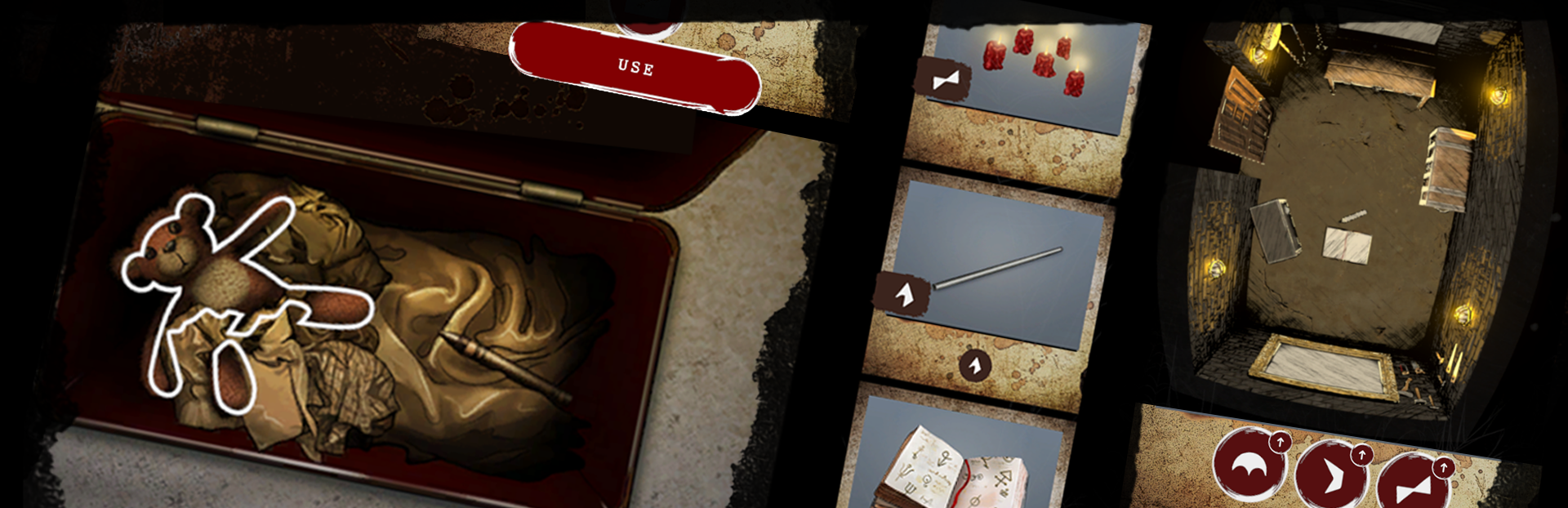
When constructing the visual layer of the gameplay, we aimed to maintain as much consistency with the paper version as possible, to ensure that the original gameplay experience was not disrupted or altered. 🎴 However, this did not mean a direct 1:1 transfer - where possible, we introduced enhancements. Cards, depending on their category, received a uniform background and animation (parallax, similar to the illustrations).

Choice cards were moved to the narrative section, with the selection itself integrated into the text layer. 📖 This approach helps to streamline the gameplay and creatively leverage the digital platform.

Visions were given a separate screen - this is a unique moment in the game that deserves its own visual treatment. Here, players learn about the character's history, what has happened in their past, and make important gameplay decisions. 🔥 To emphasize the uniqueness and surreal nature of this gameplay moment, the entire scene was given a blood-red color palette.

In summary, when developing the visual layer of Escape Tales: The Awakening, we aimed to stay as true as possible to the original, paper version of the game. 🎲 However, where possible, given the digital format and the opportunities it offers, we introduced enhancements that increase player immersion and improve the fluidity and enjoyment of the gameplay. 🎮

--- Now we’re all on the same page with the whole graphic process that’s happening in Escape Tales: The Awakening - cool, isn’t it? 😃 We can’t wait to show you what we prepared for the next time in two weeks - see you then!

Bluekey Games Team

--- PS. In the meantime, don’t forget to Add the game to your Wishlist and Follow it to stay up to date. 😏

Please note that what you see in the Dev Diary presents the work in progress, not the final product!

Don't forget to check us out:

Source

Steam News / 15 August 2024

Open original post

Changelog.gg summarizes and formats this update. How we read updates.