In this update4
Full notes
Full CIVIREVIVAL update
Read the full published notes in a cleaner layout. The original post stays linked below.
What changed
- UI and audio
- Gameplay
CIVIREVIVAL changes
Hi everyone! It’s time for another development update on CIVIREVIVAL.
During our recent playtests and in the comments, one piece of feedback kept coming up:
“The UI feels a bit uncomfortable… kind of plastic.”
That hit us hard. Because in a 4X strategy game, UI isn’t just decoration — it directly affects how players understand systems, make decisions, and stay engaged.
So in this latest iteration, we made an important decision:
A full UI overhaul.
What we’re showing today isn’t the final polished version yet, but we wanted to share the direction early — and get your feedback while it still matters.
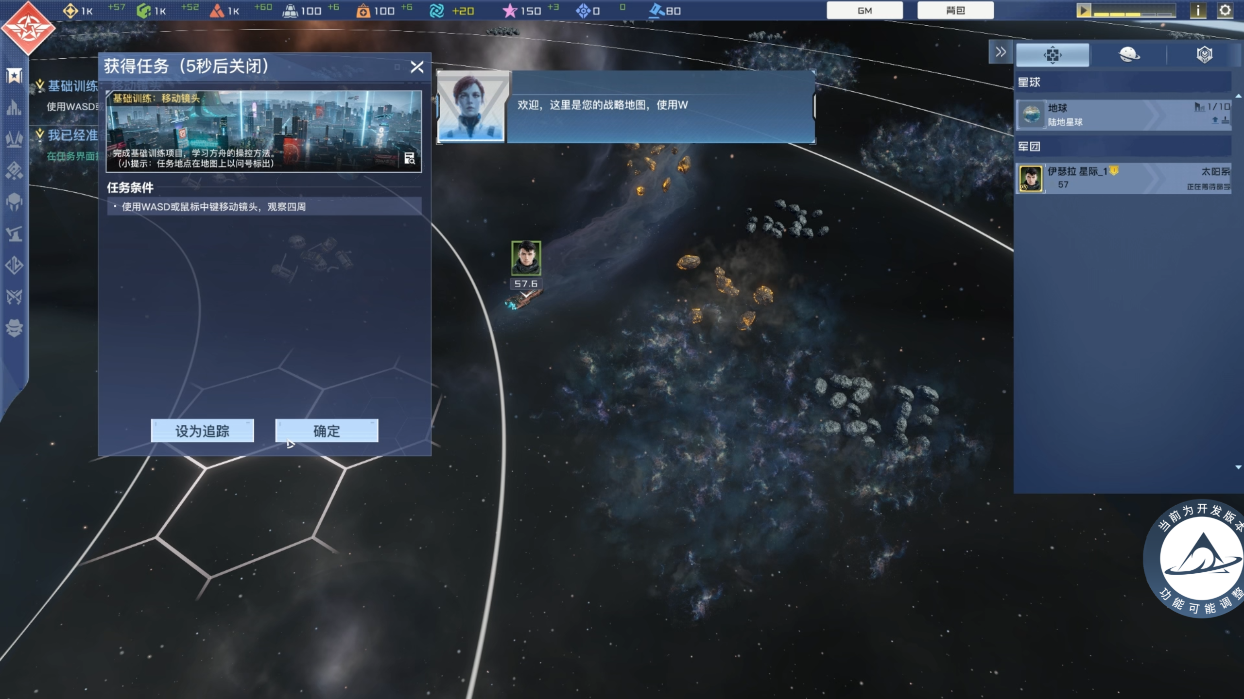
Major Combat UI Changes: Cleaner View, Clearer Commands
The biggest improvements happened in the combat interface.
We focused on two key problems:
· Better information layout
· More intuitive battle feedback
Inspired by the Total War series, we moved the unit list from the right side to the bottom of the screen:
· More battlefield visibility
· Less eye-jumping between panels
· A smoother command flow
We also rebuilt the unit information panel:
· Key stats are easier to read
· Every value includes tooltips
· Weapon ranges are clearly displayed
Our goal is simple: Make complex battles easier to understand — not harder.
Visual Style Upgrade: A True Tactical Sci-Fi Interface
To better match the space setting, we redesigned the overall UI style:
· Lower brightness, fewer oversaturated blocks
· More transparent panels and frosted glass effects
· Extra sci-fi detailing and tech lines
Now the UI feels more like a tactical overlay in space, rather than flat panels stuck on the screen.
Improved Onboarding: We Don’t Want the First Hour to Push Players Away
Beyond visuals, we also improved the early-game experience:
· Clearer tutorials
· Better early objectives
· A smoother opening flow
We want Civilization Reborn to keep its strategic depth — without overwhelming new players in the first hour.
We Need Your Feedback
This UI overhaul is only the first step. Next comes the long process of polishing interaction details:
· Is the information density right?
· What still feels awkward?
Please share your thoughts in the comments — the more specific, the better. Every piece of feedback helps shape our next iteration.
And if you like the direction we’re heading, consider wishlisting the game to support the team.
Thanks for reading — see you in the next devlog!
Source
Changelog.gg summarizes and formats this update. How we read updates.