
In this update3
Full notes
Full Tostchu update
Read the full published notes in a cleaner layout. The original post stays linked below.
What changed
- Gameplay
Tostchu changes
Welcome to our first Steamlog article! The reason for these short articles will be to showcase the thought process that goes into our first commercial project. We’re very passionate about it and want to put out the best product possible, and would like to share the challenges and obstacles with everyone out there. You can also take these as a manifestation of how elaborate we want to be in game development in general. Hopefully, it will benefit the ones who later want to walk the same path as us.
Challenges of PSX Style Horror
It is becoming a repeating trend for video games to employ visuals that were popular once upon a time, whether as a result of technical limitations or as a movement in computer graphics. Today, some developers go for a specific older platform such as NES or SNES, limiting their color palettes, trying to achieve a pixel-perfect look, and even employing some of the features from the popular games of these platforms. Others take a period, such as the early 2000s, when the industry just had gotten a hold of 3D graphics, and photographic textures and texture filtering were widely used. The time when the 3D models did not have the definition we have today but the developers still aimed for a realistic look. In short, it is a trend that happens with the mediums that are mature enough, to dig into the past and revive older movements, we can see its examples in cinema, architecture, and painting too.
Examples of video games that do a similar thing. [Top] Cyber Shadow with its NES-like visuals and gameplay. [Bottom] Signalis with its PSX-like visuals and survival gameplay similar to classics such as Resident Evil and Dino Crisis.
As such, we also chose a visual style from the past for our game, Tostchu. From the very beginning, I knew that it would have the aesthetic it currently has, which is imitating how the first PlayStation (PSX) games looked. There is an emphasis on “imitating” here because I also did want it to look a bit more modern and defined than the PSX games of the era.
There isn’t one certain reason why we have chosen this style, it is a combination of a few. When we started the project in the summer of 2022 I was really into PSX games, Mert had played a few low-poly indie horrors on his streams back then and I decided that the ambiguity and uncanny of this type of graphics serve the horror genre well. Since I’ve written a whole academic paper on abstraction and ambiguity, I was also aware of what we can achieve utilizing methods such as reduction or ellipsis. This means we are not only riding on abstraction in terms of visuals but also in space and time. This might be the topic of another article :)
When it comes to visuals, I appreciate photorealism and modern tech but have never been too excited about them, for they provide immersion via connotation to the real world but they take away our ability to utilize the player’s imagination and give them that imaginative freedom.
Enough introduction, now let me explain a few challenges I have faced regarding this PSX look and feel, and how I tackled them.
1. Color Palette and Resolution
PSX originally supported 4-bit, 8-bit, and later, 15-bit, and 24-bit color depth options. Since I wanted the dithering that games like Silent Hill have, I went with 8-bit (2^8 = 256 colors). This is one of the main reasons why the game has its specific look. Back in the day, the games used dithering so that color banding didn’t occur due to the limited number of colors. In our case, this necessary effect stemming from a technical limitation becomes an aesthetic choice.
In this screenshot, you can see the limited color depth and dithering used for Silent Hill.
For these two, we dither the image first and then limit the color palette.
Before dither and truncated color. After. Both shots are with LUT and post-processing effects applied.
On top of this, I also used a color lookup table (LUT) which gives a certain filtered look to the game. This is also the reason why the darker areas look much darker than they are. If you don’t know what an LUT is, you can imagine it as a table with two columns and every row of it has two colors: the original and the replacement. Based on this type of table the original colors are translated into the replacements. An LUT texture usually looks like a colorful band, as seen below. It is a very common method used in video games to control the final color of the picture.
This is what a LUT texture looks like.
No LUT applied. LUT applied.
Usually, the ideal way to get a consistent look in terms of colors is to prepare the textures accordingly and then create an LUT if needed after the fact, but I directly went with LUT since I use natural colors of the materials in the assets, you can see this later in the television model. Textures are almost not stylized at all. In case the asset doesn’t look like I wanted in the game I do a bit of a back and forth between the software in which I create the textures (Substance Painter or Blender) and the engine. This usually happens with dark gray/black colors since it is more difficult to show details on those colors with all this image processing.
We get our final colors with a few more post-processing effects such as vignette, reduced saturation, reduced contrast, chromatic aberration, and film grain.
Another limitation that PSX brings is the resolution. The way we do this is by making sure the height of the game’s resolution always shows 240 pixels (as in 320x240 resolution). Additionally setting the upscale mode to Nearest ensures the crunchy look is conserved. In the final game, there might be an option to double this resolution since not every PSX game runs on 240p after all, so if you want you could play in 480px height. However, this is something that is not decided at the moment. To be fair I got very used to 320x240 at this point.
2. Low-poly, Textures, and Vertex Snapping
In the second half of the 90s, 3D visuals were still very young. The way we prepare 3D models nowadays intentionally as “low-poly”, was a necessity back then. For instance, if you look at the characters in PSX fighting games, they will be between 5k-10k polygons, and if there is also a 3D environment involved this number would dip into sub-5k. To be able to run the games on PSX hardware, all of the assets, including the 3D models, had to be created in a very optimized manner.
Luckily I am very well-versed in hard surface modeling and doing it as optimal as possible. This is why modeling for Tostchu has been the easiest part of this whole process for me. For example, our television model has only 214 triangles. My approaches are focused on the in-game versions of the models and are sometimes not very conventional by industry standards. I cut a lot of corners and be destructive if need be, but it lets me gain time in the end (we have a very limited time budget for this game!).
For texturing these models I do a mix of hand-painting, using photo textures from Textures.com, and using Substance Painter’s materials. It all depends on how specific something is or how much time it will take for me to do it. And more than enough times, it also depends on what I feel like using that day :) I don’t limit myself too much on texture resolution since the effects I mentioned in the first section bring their definition down. A maximum of 1024x1024 resolution usually suffices. I don’t go too overboard as well, large textures can increase the disk size of the game. If you want to stay true to the original PSX texture resolutions, they range from 32 to 256 and rarely go down to 16 or up to 1024.
The more challenging part was to get the vertex snapping that I wanted from PSX very much. This effect is also a result of a limitation. I will not get into detail about this but in short, PSX didn’t have enough precision for vertex coordinates so the vertices had to sometimes have the closest coordinates they could have. Let’s say the corner of that TV model needs to be at (1.599, 3.231, 12.215) coordinates in 3D space, at a certain distance it couldn’t be at all on PSX, so it would rather be placed at something like (1.2, 3.1, 12.2). This way if something needed to move from the player’s point of view they jumped from one number to another which created this not-very-smooth-looking wobbling effect.
An example of vertex wobble from Metal Gear Solid.
I must admit that I thought this effect would be more difficult to achieve at first. How I did it in Unreal Engine is quite similar to how the original effect came to be, I round the camera relative position of the vertices. On top of that, I also use a custom grid size so the effect can be as exaggerated as I want it to be. After adding this effect I also had to always keep in mind that the models can’t have any detail in their geometry that is too small since then the vertices could break the model by destroying the small details. This is why, for instance, the glass jars have a certain thickness in the below gif.
Vertex wobble in PSX also scales based on the distance from the camera. Geometry that is closer to the camera shows it less since the coordinates are more precise. This is something we currently don’t have in our project but might consider adding it too.
I wouldn’t like to finish without mentioning affine texture mapping, which is another PSX signature effect. It makes the textures look skewed at times. It’s authentic, yes, but I don’t think this effect serves the game and whenever it is used in a game I find it distracting so I decided to pass on that. These interesting effects were the outcome of technical limitations back then but today, there is no obligation to stick to any of them, you can pick the ones that serve your visual direction and let go of the rest.
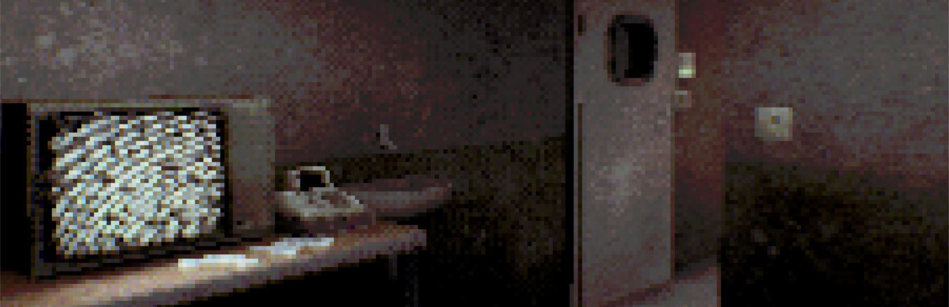
All of the above combined provide us with the look we aimed to have in this game. I think it immensely helps to make it feel more uncanny and slightly disturbing. As I mentioned earlier, the abstraction it creates with the colors and the shapes gives a lot of space for imagination to run wild.
I hope you will enjoy this aesthetic as much as we do!
~Anıl Demir Tostchu Designer, Artist & Programmer
Source
Changelog.gg summarizes and formats this update. How we read updates.