HomeGamesUpdatesPricingMethodology
Steam News28 May 20261mo ago

First Patch Incoming

Hey all, Thanks to our very first review (negative, but constructive and fair), we have our very first patch in QA right now. So, what is it about?

In this update1

Full notes

Full Tilting - A Noir Poker Career update

Read the full published notes in a cleaner layout. The original post stays linked below.

What changed

0 fixes0 additions2 changes0 removals
  • UI and audio
changedHey all,Thanks to our very first review (negative, but constructive and fair), we have our very first patch in QA right now. So, what is it about? Basically, it's the first of 2 main things the reviewer mentioned: Lack of readability for cards and UI text.
changedHey all,Originally, the way we opted to achieve the pixelated retro look was to have a sub-1024 canvas and scale it up, but that made certain parts hard to read, so we are increasing the game canvas and being more deliberate about the parts of the UI that get to retain the pixelated look. Also, the bitmaps that render the card suits have been reworked from simple 10x10 to 23x23 (the odd number makes for better and sharper symmetry).

Tilting - A Noir Poker Career changes
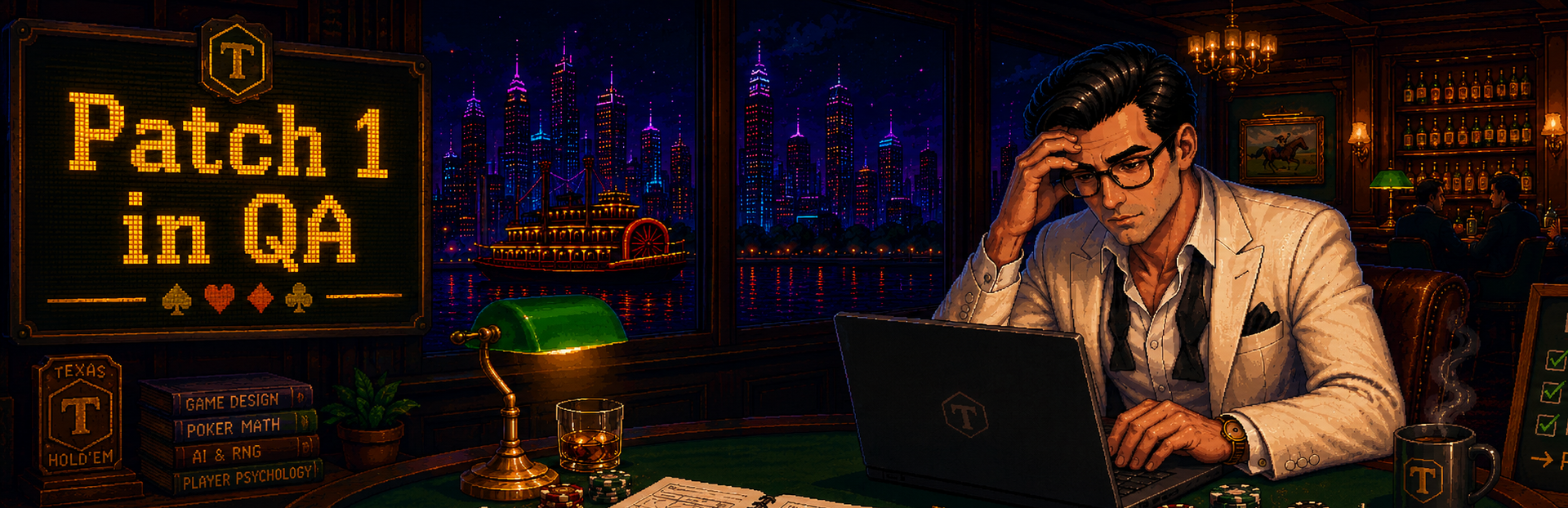
changedThanks to our very first review (negative, but constructive and fair), we have our very first patch in QA right now. So, what is it about? Basically, it's the first of 2 main things the reviewer mentioned: Lack of readability for cards and UI text.
changedOriginally, the way we opted to achieve the pixelated retro look was to have a sub-1024 canvas and scale it up, but that made certain parts hard to read, so we are increasing the game canvas and being more deliberate about the parts of the UI that get to retain the pixelated look. Also, the bitmaps that render the card suits have been reworked from simple 10x10 to 23x23 (the odd number makes for better and sharper symmetry).

Hey all,

Thanks to our very first review (negative, but constructive and fair), we have our very first patch in QA right now. So, what is it about? Basically, it's the first of 2 main things the reviewer mentioned: Lack of readability for cards and UI text.

Originally, the way we opted to achieve the pixelated retro look was to have a sub-1024 canvas and scale it up, but that made certain parts hard to read, so we are increasing the game canvas and being more deliberate about the parts of the UI that get to retain the pixelated look. Also, the bitmaps that render the card suits have been reworked from simple 10x10 to 23x23 (the odd number makes for better and sharper symmetry).

Hopefully, we get to keep the look while also improving your ability to clearly read your character's powers and your hole cards. Please, even if it's negative, feel free to hit us with more feedback. We are eager to take this journey with you all into a better game that speaks to what you guys would like to experience.

Thank you!

Source

Steam News / 28 May 2026

Open original post

Changelog.gg summarizes and formats this update. How we read updates.