In this update7
Full notes
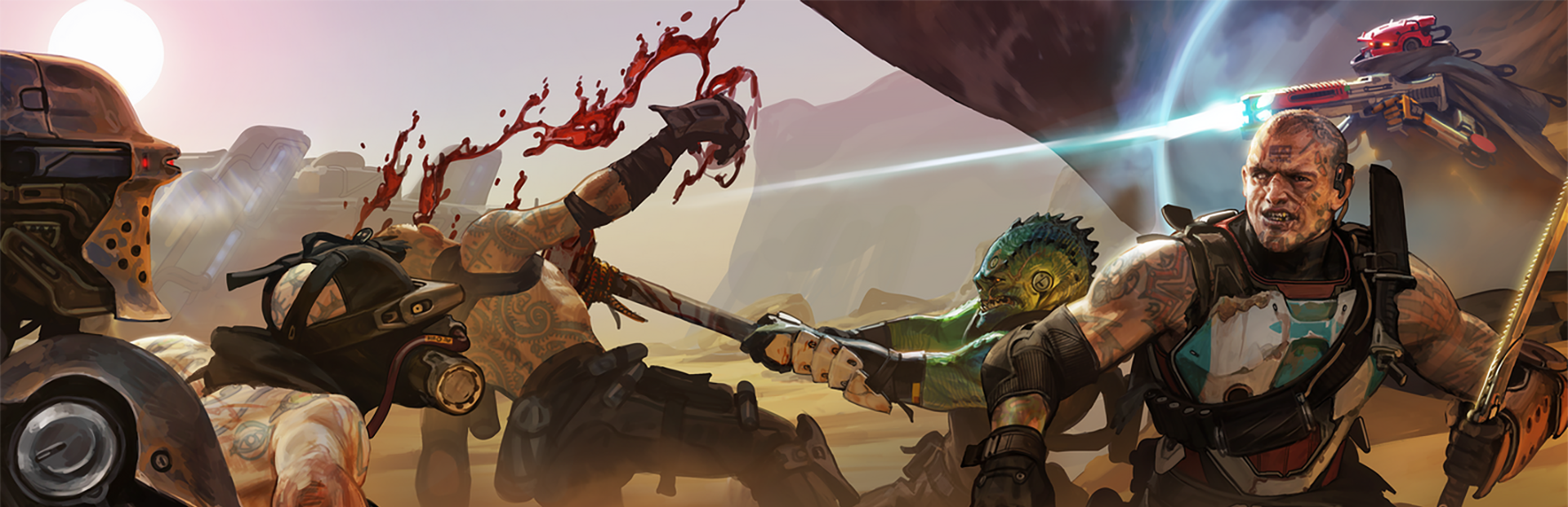
Full Space Scum update
Read the full published notes in a cleaner layout. The original post stays linked below.
What changed
- UI and audio
- Gameplay
Space Scum changes
Hey everyone 👋
So, we hear some of you don’t like our UI? WELL THAT’S JUST FINE. I guess we’ll just redesign the whole thing! And we have... Here’s a preview of the redesign and the thinking behind it.
When we first built the UI for Space Scum our focus was on function over form. We wanted to make sure that every stat, piece of equipment and button was in the right place for the game. It worked, but it didn’t feel quite right.
Space Scum isn’t meant to be about sleek interfaces and optimistic sci-fi exploration. It’s more about desperation, survival, and struggling to exist in a hostile universe. The old UI, with its glowing teal lines and cartoonish icons, felt sterile and even playful. It clashed with the grim dark tone we want the player to feel in every interaction.
That’s why we’ve gone back to rework the UI from the ground up. Instead of clean neon borders, we’re shifting toward a grittier aesthetic inspired by games like Darkest Dungeon and Space Marine, worn metallic colors, muted palettes and imperfect textures. The goal is for the interface itself to carry the same tension and weight as the game world it represents.
Modals & Panels
The perfectly rectangular, glowing cyan borders gave the interface a clean, futuristic look which dominates the screen and pulls attention away from the actual interactive content the player wants to be focused on.
We wanted to reduce these outlines, push them more into the background and introduce some imperfection by adding a worn, scratched look to them.
Steam post image
Colour Palette
One of the first things we realized was that the old UI’s colour palette was working directly against the tone of the game. For the rework, we shifted toward a palette that carries more weight and mood.
The foundation of the interface is darkness. Deep blacks and heavy grays set the tone. Muted grays and golds with scratches give the impression of aged metal.
The darkness of the background and outlines gives us a chance to allow certain UI elements to stand out, in contrast to the black. To do this we’ve selected a range of complimentary colours in order to “code” distinctions between certain elements. The character stats, for example, use these colours to make it easier to instantly see which particular stat you’re looking at. We’ve also used these colours for the abilities to more easily distinguish between attack, defense and support abilities.
Steam post image
Icons
The icons for character traits and skills leaned toward a playful style, almost comical, which read too much like lighthearted caricatures, breaking the immersion by undercutting the darker tone.
The ability icons looked very similar to the various button icons used throughout the game, they didn’t stand out as important or special in any way. We wanted to make it more obvious which icon type the player is looking at.
We’ve redesigned the traits, skills and abilities icons to be very distinct from each other.
The traits are now styled like framed portraits or paintings, almost like a galley of a character’s personalities.
The skills have been reworked into a hex shaped, monochrome, retro-futuristic interface style that has become iconic in sci-fi design.
The abilities pair a minimal, vector style icon with coloured elements indicating the category and technique of the specific ability, inside a diamond shaped frame reminiscent of crests or badges.
Buttons
Many buttons in the old UI were indistinguishable from regular UI panels or boxes. They shared the same rectangular shapes, which caused confusion during playtesting. Players frequently hesitated to interact with the interface, unsure which elements were actionable.
We redesigned the buttons to be either completely circular or have fully rounded edges, creating a visual distinction from other UI elements. The rounded shape immediately sets them apart from the other UI elements in the game.
This is still a work in progress and we’d love to know how it feels to you. Drop your thoughts below, your feedback helps us make Space Scum the game it deserves to be.
Simon & Ed
Looking for more?
Another Forklift-published game Roman Triumph has just launched in 1.0! 🏛️
Build your city, defend it from invaders, please the gods, and see how long you can survive 👇🏻
Source
Changelog.gg summarizes and formats this update. How we read updates.