Developing a Background Art Style for my Visual Novel
Background art is considered by many artists as the final boss of illustration. I'm less afraid of it having spent plenty of time in my professional career working with concepting environments as well as making textures
Full notes
Full Slipstream Daydreams update
Read the full published notes in a cleaner layout. The original post stays linked below.
What changed
1 fix2 additions4 changes0 removals
Maps
Gameplay
Performance
Fixes
addedI chose the first area of the script to experiment with, the airport-like hangar Orion walks through to reach their craft for the start of the race. Luckily airports are something I could get some real images of, but I immediately ran into the problem of people - my style isn't as styised as some, but it's still easy to tell the difference between my art and a photograph. I would need to edit out and/or redraw any figures visible for the final assets... I left the less prominent ones for the purposes of this experiment but it really wasn't ideal. As well as this, trying to marry even two images into one new scene was difficult - when you're photobashing for concept art, the result doesn't need to be super polished, but here it was very obvious the parts I'd roughly painted over had less texture than the photographic elements. I had hoped the filtering stage of the process would perhaps fudge some of this, and pressed onwards, despite how long the paintover actually took me - wasn't this supposed to be a shortcut?!
changedIn September 2024 I threw myself into many rounds of experimentation. My first thought was to try some limited palette dithering, a technique inspired by what I'd used to process images for a recent zine . I really liked the grainy texture in that context, and this might have worked well in a pixelly PC-98 inspired game, but here it didn't really work - I wanted a glossy, shiny y2k sheen on everything. Using gradient maps and then blurring the result looked pretty nice, and I liked the bloom effect it produced in the light, but the palettes on all of these were hard to control. The last version here was using a posterise filter, which produced interesting colour interactions, but in the end I felt the texture and level of detail coming through from the photo was just too much to fit with my sprite art.
addedI came back to this a month later with a new idea - to smooth out the photos, I would use Illustrator's vector auto trace feature! This is the closest I got to being happy with filtering, but I again ran into the same issue with gradient mapping the images to colour them that it was only able to assign colours to values, and I just wasn't able to use the bright palette I wanted without having to make compromises in readability. Also, I was missing out the glowy, glossy, gradient-heavy look I had in mind!
changedBefore releasing my closed alpha test in early 2025, I decided in the eleventh hour that I should at least have some thumbnails for the backgrounds so my scenes weren't completely contextless. With limited time budget left before my self-imposed deadline of the end of March, I bashed out the first thing that came to mind for (almost) all the bgs featured in Capital's route, including flashbacks and race scenes. Somehow, in this frenzy, I realised that it was actually... easier than expected?! I had thought about this world at great length and I had a very specific idea of what I wanted this glossy y2k future to look like. Getting these really quick roughs done was what sealed the deal for me - I was going to need to draw these damn things myself, huh.
changedI took a break in development after the initial bugfixes from my alpha demo, and returned to the project in late summer. My focus now was getting a vertical slice completed for a public-facing demo, with (close to) final assets for the first set of flashbacks for both routes. Time to finally work out my rendering style for these.
changedMy first thought was to go for a lineless colour block style with lots of gradients overlaid on top. I'd done a lot of character art a few years back in this lineless style and I had found it quick and stylish, so surely this would be perfect and a little quicker than a fully lined background like I would usually go for in an illustration! Well, unfortunately that wasn't the case. In the first environment I'd chosen to experiment with (one I was excited to work on so I would focus better!) I struggled a lot to capture the clean curves of the space I'd thumbnailed, and because it was an environment and not a character it was much more important capturing hard-edged form, so the shading had to be more exact. This meant hours of laboriously going back over my edges to get them crisp, and after I had put about 6 hours into rendering it (below) I realised it really wasn't going in a direction I liked. I was getting super frustrated at this point!
Slipstream Daydreams changes
addedI chose the first area of the script to experiment with, the airport-like hangar Orion walks through to reach their craft for the start of the race. Luckily airports are something I could get some real images of, but I immediately ran into the problem of people - my style isn't as styised as some, but it's still easy to tell the difference between my art and a photograph. I would need to edit out and/or redraw any figures visible for the final assets... I left the less prominent ones for the purposes of this experiment but it really wasn't ideal. As well as this, trying to marry even two images into one new scene was difficult - when you're photobashing for concept art, the result doesn't need to be super polished, but here it was very obvious the parts I'd roughly painted over had less texture than the photographic elements. I had hoped the filtering stage of the process would perhaps fudge some of this, and pressed onwards, despite how long the paintover actually took me - wasn't this supposed to be a shortcut?!
changedIn September 2024 I threw myself into many rounds of experimentation. My first thought was to try some limited palette dithering, a technique inspired by what I'd used to process images for a recent zine . I really liked the grainy texture in that context, and this might have worked well in a pixelly PC-98 inspired game, but here it didn't really work - I wanted a glossy, shiny y2k sheen on everything. Using gradient maps and then blurring the result looked pretty nice, and I liked the bloom effect it produced in the light, but the palettes on all of these were hard to control. The last version here was using a posterise filter, which produced interesting colour interactions, but in the end I felt the texture and level of detail coming through from the photo was just too much to fit with my sprite art.
addedI came back to this a month later with a new idea - to smooth out the photos, I would use Illustrator's vector auto trace feature! This is the closest I got to being happy with filtering, but I again ran into the same issue with gradient mapping the images to colour them that it was only able to assign colours to values, and I just wasn't able to use the bright palette I wanted without having to make compromises in readability. Also, I was missing out the glowy, glossy, gradient-heavy look I had in mind!
changedBefore releasing my closed alpha test in early 2025, I decided in the eleventh hour that I should at least have some thumbnails for the backgrounds so my scenes weren't completely contextless. With limited time budget left before my self-imposed deadline of the end of March, I bashed out the first thing that came to mind for (almost) all the bgs featured in Capital's route, including flashbacks and race scenes. Somehow, in this frenzy, I realised that it was actually... easier than expected?! I had thought about this world at great length and I had a very specific idea of what I wanted this glossy y2k future to look like. Getting these really quick roughs done was what sealed the deal for me - I was going to need to draw these damn things myself, huh.
changedI took a break in development after the initial bugfixes from my alpha demo, and returned to the project in late summer. My focus now was getting a vertical slice completed for a public-facing demo, with (close to) final assets for the first set of flashbacks for both routes. Time to finally work out my rendering style for these.
Background art is considered by many artists as the final boss of illustration. I'm less afraid of it having spent plenty of time in my professional career working with concepting environments as well as making textures, but I the time element involved made me very anxious to commit to drawing what I calculated to be dozens of different areas for Slipstream Daydreams. There are many examples of great visual novels that use filtered stock photos as their backgrounds (Umineko being a notable example), but since SSDD is set in a y2k cyber future I couldn't exactly get what I needed from Pexels, so my next thought was to try photobashing different images together into something that more suited my distinct image of the setting. Surely this could be the best of both worlds!
I chose the first area of the script to experiment with, the airport-like hangar Orion walks through to reach their craft for the start of the race. Luckily airports are something I could get some real images of, but I immediately ran into the problem of people - my style isn't as styised as some, but it's still easy to tell the difference between my art and a photograph. I would need to edit out and/or redraw any figures visible for the final assets... I left the less prominent ones for the purposes of this experiment but it really wasn't ideal. As well as this, trying to marry even two images into one new scene was difficult - when you're photobashing for concept art, the result doesn't need to be super polished, but here it was very obvious the parts I'd roughly painted over had less texture than the photographic elements. I had hoped the filtering stage of the process would perhaps fudge some of this, and pressed onwards, despite how long the paintover actually took me - wasn't this supposed to be a shortcut?!
In September 2024 I threw myself into many rounds of experimentation. My first thought was to try some limited palette dithering, a technique inspired by what I'd used to process images for a recent zine. I really liked the grainy texture in that context, and this might have worked well in a pixelly PC-98 inspired game, but here it didn't really work - I wanted a glossy, shiny y2k sheen on everything. Using gradient maps and then blurring the result looked pretty nice, and I liked the bloom effect it produced in the light, but the palettes on all of these were hard to control. The last version here was using a posterise filter, which produced interesting colour interactions, but in the end I felt the texture and level of detail coming through from the photo was just too much to fit with my sprite art.
I came back to this a month later with a new idea - to smooth out the photos, I would use Illustrator's vector auto trace feature! This is the closest I got to being happy with filtering, but I again ran into the same issue with gradient mapping the images to colour them that it was only able to assign colours to values, and I just wasn't able to use the bright palette I wanted without having to make compromises in readability. Also, I was missing out the glowy, glossy, gradient-heavy look I had in mind!
Disgruntled at still being unable to nail the look I had in mind, I decided to put this on the back burner and prioritise other aspects of SSDD's development.
Before releasing my closed alpha test in early 2025, I decided in the eleventh hour that I should at least have some thumbnails for the backgrounds so my scenes weren't completely contextless. With limited time budget left before my self-imposed deadline of the end of March, I bashed out the first thing that came to mind for (almost) all the bgs featured in Capital's route, including flashbacks and race scenes. Somehow, in this frenzy, I realised that it was actually... easier than expected?! I had thought about this world at great length and I had a very specific idea of what I wanted this glossy y2k future to look like. Getting these really quick roughs done was what sealed the deal for me - I was going to need to draw these damn things myself, huh.
I took a break in development after the initial bugfixes from my alpha demo, and returned to the project in late summer. My focus now was getting a vertical slice completed for a public-facing demo, with (close to) final assets for the first set of flashbacks for both routes. Time to finally work out my rendering style for these.
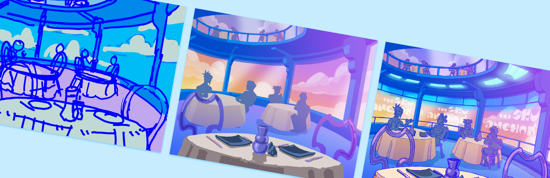
My first thought was to go for a lineless colour block style with lots of gradients overlaid on top. I'd done a lot of character art a few years back in this lineless style and I had found it quick and stylish, so surely this would be perfect and a little quicker than a fully lined background like I would usually go for in an illustration! Well, unfortunately that wasn't the case. In the first environment I'd chosen to experiment with (one I was excited to work on so I would focus better!) I struggled a lot to capture the clean curves of the space I'd thumbnailed, and because it was an environment and not a character it was much more important capturing hard-edged form, so the shading had to be more exact. This meant hours of laboriously going back over my edges to get them crisp, and after I had put about 6 hours into rendering it (below) I realised it really wasn't going in a direction I liked. I was getting super frustrated at this point!
I took yet ANOTHER weeks-long break from this problem and eventually resigned myself to doing what I was trying to skip from the start - a background with full lineart, shading and a slightly limited palette, with gradients on top and hand painted glowing elements. The thing I'd been desperately trying to avoid doing this whole time. And y'know what? It looked great and while obviously being time-consuming, because it was a workflow I was very familiar with it didn't take as long as I was afraid of. The advantage of my style using fixed-width linearts meant I could make liberal use of the bezier pen tool for all those long curves and the lines blended in fine with my hand-drawn lines.
Below is the final version of the restaurant background, and how it looks in-game!
Steam post imageSteam post image
In conclusion I think it was well worth putting together so many different experiments, and some of them would have absolutely been sufficient in a jam game, but with my own bar of quality and specific mental image of the setting meant it felt worth it putting in the work to do these as I usually would illustrate a full scene. Please enjoy looking at them in detail in the final release!