ORIGINALLY POSTED FEBRUARY 28TH 2025 From the beginning I knew I wanted my visual novel to be formatted in nvl style with a more prose-like approach.
In this update4
Full notes
Full Slipstream Daydreams update
Read the full published notes in a cleaner layout. The original post stays linked below.
What changed
0 fixes3 additions3 changes0 removals
Gameplay
UI and audio
addedORIGINALLY POSTED FEBRUARY 28TH 2025From the beginning I knew I wanted my visual novel to be formatted in nvl style with a more prose-like approach. I was more confident in my ability to write like this over a more traditional dialogue focused vn style, and I really liked the way Disco Elysium laid out its screen with a scrolling column of text on the right hand side. As we are all so used to reading on our smartphones, the column format would remove the issue of daunting walls of text that often comes along with the nvl format, as well as being more ergonomic due to less eye movement. It has the added effect of making the "viewport" part of the screen that has the art closer to a 4:3 aspect ratio used by older monitors and TVs, gesturing at a bit of nostalgia for the early 00s which inspires the universe's visual design.
addedORIGINALLY POSTED FEBRUARY 28TH 2025One of my goals with the UI was not only making it clean and cool but also having a small variety of accessibility options on top of Ren'py's built-in accessibility menu. The options I added myself are three different text size options, a dyslexia friendly font, and a dark mode theme. This turned out to be a lot more involved than I expected, and took a good chunk of development time, but I'm proud of the result and hopefully my hard work means more people will be able to read the finished project!
changedDyslexic FontThis was the easiest option to implement - Ren'py's inbuilt accessibility options do actually contain a dyslexia friendly font switch but I find the options a little hidden and I prefer the look of Atkinson Hyperlegible so wanted to use that instead. You can watch this video to learn about how it is designed for people with Dyslexia and other types of limited vision.
changedText Size OptionsThis is also included in more granular detail within Ren'Py's accessibility options, but I wanted a more streamlined easy approach. This was pretty easy to implement, it changes the default gui text size and then all my other gui text sizes are that multiplied by different values - for example, character name labels are [c]gui.text_size*2[/c].
changedDark ModeUnfortunately, this turned out to be a complete nightmare to implement. If I had built my UI system from scratch instead of using Ren'py's template I might have had a better time, but that is outside of my scope let alone my skillset. Initially the switch was entirely driven by a radio button in my settings, which changed a list of variables one by one - but this was incredibly slow. The engine lagged for a couple of seconds as it changed, which felt really bad, so I looked into other options. In the end, I settled on a filter that inverts the entire user interface but just the values, not the hue - this was way snappier, and meant I didn't have to make separate light/dark mode versions of assets! This feature is something that's really important for me, even if my vision for the project was a really bright, light UI - the best kind of UI is one the most people can read, so I wanted to get this right even if it involved a frankly disproportionate amount of dev time.
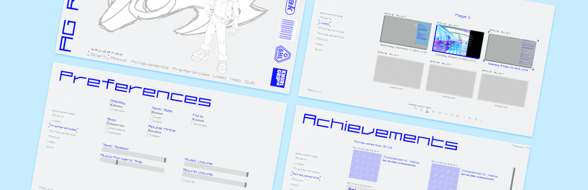
addedDark ModeAbove are screenshots of my preferences window as it stands now, in both light and dark modes. There's a few other new settings since my concepts, as I added some excellent plugins - please check out Automatic Speech Pauses For Ren'Py and Timed Choice Menu in Ren'Py !
Slipstream Daydreams changes
addedFrom the beginning I knew I wanted my visual novel to be formatted in nvl style with a more prose-like approach. I was more confident in my ability to write like this over a more traditional dialogue focused vn style, and I really liked the way Disco Elysium laid out its screen with a scrolling column of text on the right hand side. As we are all so used to reading on our smartphones, the column format would remove the issue of daunting walls of text that often comes along with the nvl format, as well as being more ergonomic due to less eye movement. It has the added effect of making the "viewport" part of the screen that has the art closer to a 4:3 aspect ratio used by older monitors and TVs, gesturing at a bit of nostalgia for the early 00s which inspires the universe's visual design.
addedOne of my goals with the UI was not only making it clean and cool but also having a small variety of accessibility options on top of Ren'py's built-in accessibility menu. The options I added myself are three different text size options, a dyslexia friendly font, and a dark mode theme. This turned out to be a lot more involved than I expected, and took a good chunk of development time, but I'm proud of the result and hopefully my hard work means more people will be able to read the finished project!
changedThis was the easiest option to implement - Ren'py's inbuilt accessibility options do actually contain a dyslexia friendly font switch but I find the options a little hidden and I prefer the look of Atkinson Hyperlegible so wanted to use that instead. You can watch this video to learn about how it is designed for people with Dyslexia and other types of limited vision.
changedThis is also included in more granular detail within Ren'Py's accessibility options, but I wanted a more streamlined easy approach. This was pretty easy to implement, it changes the default gui text size and then all my other gui text sizes are that multiplied by different values - for example, character name labels are [c]gui.text_size*2[/c].
changedUnfortunately, this turned out to be a complete nightmare to implement. If I had built my UI system from scratch instead of using Ren'py's template I might have had a better time, but that is outside of my scope let alone my skillset. Initially the switch was entirely driven by a radio button in my settings, which changed a list of variables one by one - but this was incredibly slow. The engine lagged for a couple of seconds as it changed, which felt really bad, so I looked into other options. In the end, I settled on a filter that inverts the entire user interface but just the values, not the hue - this was way snappier, and meant I didn't have to make separate light/dark mode versions of assets! This feature is something that's really important for me, even if my vision for the project was a really bright, light UI - the best kind of UI is one the most people can read, so I wanted to get this right even if it involved a frankly disproportionate amount of dev time.
ORIGINALLY POSTED FEBRUARY 28TH 2025
From the beginning I knew I wanted my visual novel to be formatted in nvl style with a more prose-like approach. I was more confident in my ability to write like this over a more traditional dialogue focused vn style, and I really liked the way Disco Elysium laid out its screen with a scrolling column of text on the right hand side. As we are all so used to reading on our smartphones, the column format would remove the issue of daunting walls of text that often comes along with the nvl format, as well as being more ergonomic due to less eye movement. It has the added effect of making the "viewport" part of the screen that has the art closer to a 4:3 aspect ratio used by older monitors and TVs, gesturing at a bit of nostalgia for the early 00s which inspires the universe's visual design.
Below is a moodboard I put together of my influences - it includes screenshots from WipeEout, WipEout Omega Collection, and Neon White, as well as futuristic graphic design from and influenced by the turn of the millennium.
I took screenshots of each menu screen and edited them to make mockups of each before implementing. Working this way was easier than from scratch on a blank canvas, and also meant I didn't plan to change too much in each, making the implementation process less intensive. I used the Artboards feature in Photoshop to lay out all of my designs in one document while still keeping them separate. These behave sort of like layer groups, but also have their own separate canvas areas. It helped me view all of my different screens together, which helped me identify what I needed to change and unify in each.
One of my goals with the UI was not only making it clean and cool but also having a small variety of accessibility options on top of Ren'py's built-in accessibility menu. The options I added myself are three different text size options, a dyslexia friendly font, and a dark mode theme. This turned out to be a lot more involved than I expected, and took a good chunk of development time, but I'm proud of the result and hopefully my hard work means more people will be able to read the finished project!
Dyslexic Font
This was the easiest option to implement - Ren'py's inbuilt accessibility options do actually contain a dyslexia friendly font switch but I find the options a little hidden and I prefer the look of Atkinson Hyperlegible so wanted to use that instead. You can watch this video to learn about how it is designed for people with Dyslexia and other types of limited vision.
Text Size Options
This is also included in more granular detail within Ren'Py's accessibility options, but I wanted a more streamlined easy approach. This was pretty easy to implement, it changes the default gui text size and then all my other gui text sizes are that multiplied by different values - for example, character name labels are [c]gui.text_size*2[/c].
Dark Mode
Unfortunately, this turned out to be a complete nightmare to implement. If I had built my UI system from scratch instead of using Ren'py's template I might have had a better time, but that is outside of my scope let alone my skillset. Initially the switch was entirely driven by a radio button in my settings, which changed a list of variables one by one - but this was incredibly slow. The engine lagged for a couple of seconds as it changed, which felt really bad, so I looked into other options. In the end, I settled on a filter that inverts the entire user interface but just the values, not the hue - this was way snappier, and meant I didn't have to make separate light/dark mode versions of assets! This feature is something that's really important for me, even if my vision for the project was a really bright, light UI - the best kind of UI is one the most people can read, so I wanted to get this right even if it involved a frankly disproportionate amount of dev time.
Above are screenshots of my preferences window as it stands now, in both light and dark modes. There's a few other new settings since my concepts, as I added some excellent plugins - please check out Automatic Speech Pauses For Ren'Py and Timed Choice Menu in Ren'Py!
Hopefully this extra attention can allow more players to enjoy reading Slipstream Daydreams! Working on them has made me appreciate why these are often left out of games, but I want to bring my little story to as many people as I can!