Full notes
Full PSolTrix update
Read the full published notes in a cleaner layout. The original post stays linked below.
What changed
- Gameplay
- UI and audio
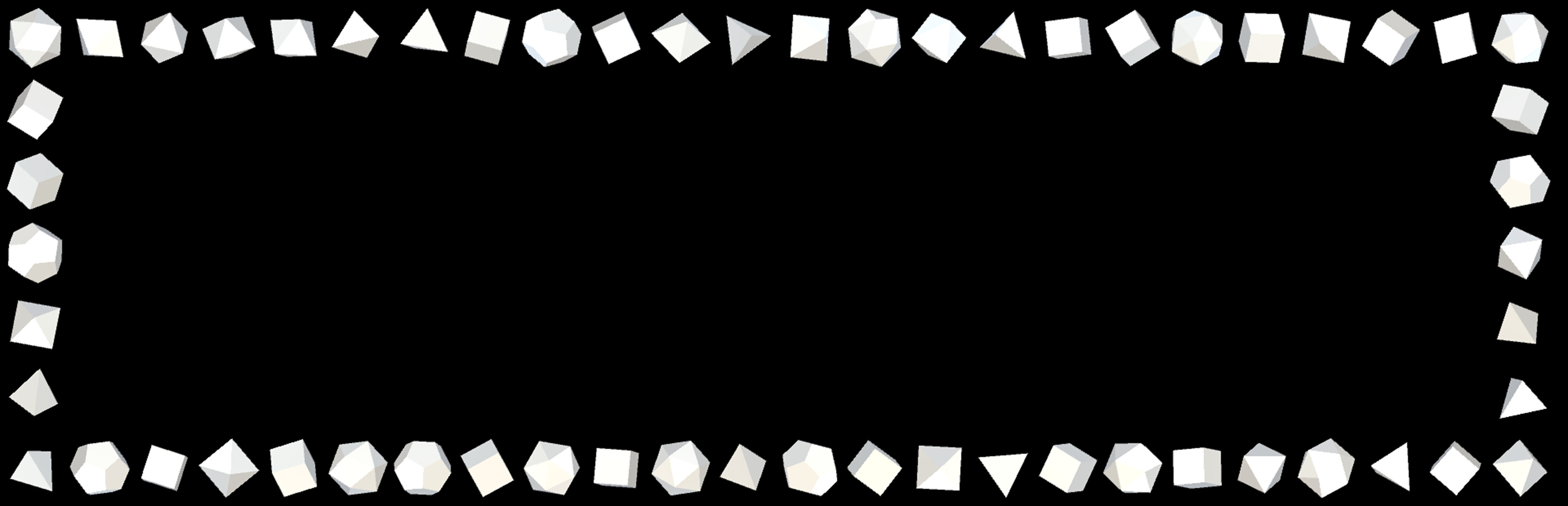
It turned out that new players still have problems understanding the geometries of PSolTrix, especially that the spheres consist of many rows/shells/layers. The update contains several changes that will, hopefully, give people a better understanding of what is going on:
The different layers of the falling pieces/tetrominos are now rendered with a gap between them. I hope this will illustrate the different layers more clearly. There is also a slider in the menu to adjust the size of that gap.
Adjustment of initial parameters for visualization of piece.
If a piece is placed wrongly during the tutorial the camera will rotate more, to give players a better view of what went wrong.
There is an extra step in the tutorial, showing an animation of the different layers.
The transition from piece to tile-on-field is slowed down in the tutorial, to give players a better visualization of the relationship between piece and field.
Additionally, there are these additions:
Text position and size in tutorial is adjusted correctly, when the camera distance is changed in the menu.
Adjustment of ui-positions, if Dotris or Icotris scene is shown inside the menu. Basically, the ui is moved out of the way a bit, to improve visibility of the parts that can be adjusted in the given menu.
Dotris/Icotris scene is faded towards black if it is shown in menu and menu-text is shown in front of it. This improves readability of menu-text, if it hovers over a Tris-scene.
Removal of "Merge Rows" option in menu. The visual difference is so minimal, that it isn't necessary.
Minor change to colors of "flow-background" in menu. Background colors and colors of text are different, now, which improves readability.
Source
Changelog.gg summarizes and formats this update. How we read updates.