Full notes
Full HyperDot update
Read the full published notes in a cleaner layout. The original post stays linked below.
What changed
0 fixes1 addition1 change0 removals
- Gameplay
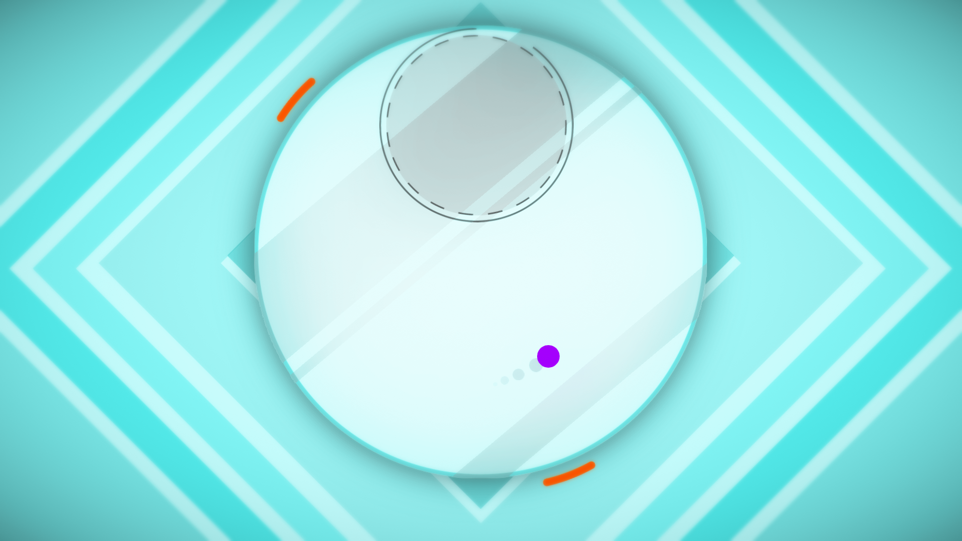
changedEarlier in development, Charles made a small but meaningful tweak to the HyperDot logo. Spot the difference.
addedAfter:That shade of red changed just a tad, and if you're red-green colorblind, it makes a world of difference. We got feedback that on certain backgrounds, half the title vanished and it looked like the game was just called "|dot." Add a little more blue to that red and ✨ ta-da! Red-green colorblind approved. And while we're on the topic, HyperDot also features a color-blind mode. That's play without compromise.
HyperDot changes
changedEarlier in development, Charles made a small but meaningful tweak to the HyperDot logo. Spot the difference.
addedThat shade of red changed just a tad, and if you're red-green colorblind, it makes a world of difference. We got feedback that on certain backgrounds, half the title vanished and it looked like the game was just called "|dot." Add a little more blue to that red and ✨ ta-da! Red-green colorblind approved. And while we're on the topic, HyperDot also features a color-blind mode. That's play without compromise.
Earlier in development, Charles made a small but meaningful tweak to the HyperDot logo. Spot the difference.
Before:
After:
That shade of red changed just a tad, and if you're red-green colorblind, it makes a world of difference. We got feedback that on certain backgrounds, half the title vanished and it looked like the game was just called "|dot." Add a little more blue to that red and ✨ ta-da! Red-green colorblind approved. And while we're on the topic, HyperDot also features a color-blind mode. That's play without compromise.
Source
Changelog.gg summarizes and formats this update. How we read updates.