In this update10
Full notes
Full Dark Dreams on Diverging Roads update
Read the full published notes in a cleaner layout. The original post stays linked below.
What changed
- Maps
- Performance
- UI and audio
- Compatibility
- Fixes
- Gameplay
Dark Dreams on Diverging Roads changes
Introduction
I kept waffling about what Dark Dreams on Diverging Roads (DDDR) could truly be defined as. It’s a puzzle game. It’s a narrative game. But at its core, the game is driving. That’s what the player will be doing most of the time, so driving (and navigation) has to feel good. And in order to make sure it felt good… I had to test it.
I felt hesitant about testing because I didn’t want people to see how unfinished the game was. But I realized doing a small test on the core mechanics earlywould be a lot better than finding out there were key issues with the core mechanics much later on.
(It’s funny, I’m a professional user researcher. I know the importance of early testing. But when you’re making art, it’s really easy to feel insecure about it.)
In April I ran a small playtest on the controls and how it felt to navigate to objective locations, using a unique level created just for the test. Resources went towards preparing this level instead of the base game, and I worried that it was a waste of time. But the feedback I got turned out to be extremely helpful and I had some important revelations along the way. I can confidently say the game is better as a result.
Terrain and Map
Before making the playtest level I had to (once and for all) decide what I was going to do for the terrain. This was not my area of expertise so I had been struggling for a while.
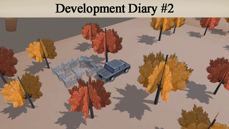
I knew I could create a terrain object in Unity, or make a giant mesh in Blender (or equivalent). But I needed something that was really easy to change in order to iterate and get the balance right (i.e. setting up the right distances between the coffee shops). I ended up making a couple of giant terrain meshes for the first level with a river filling in the gaps between. This was shown in the teaser trailer.
It didn’t feel right. And it wasn’t easy to change.
Earlier this year I played a game called Strange Horticulture. The game’s really neat. You’re the owner of an occult plant store, tasked with identifying weird plants for your clients. There’s also a 2D grid-based map that represents the game’s world. Each in-game day you receive a mysterious puzzle that you solve by figuring out which square to click on.
Steam post image Strange Horticulture and Strange Antiquities are great. They’re eerie and cozy at the same time. Please play them!
I had an “oh shit” moment.
Honestly, I’m not sure why I didn’t think of this sooner; maybe this is also an example of my inexperience. But I realized I should go with a tile-based map. So now, instead of using giant meshes, the terrain is composed of uniformly sized tiles (very simple meshes) that I neatly arranged. These tiles can be altered to reflect different terrain types (even water).
This is what the basic tile for the first level looks like. The sides that don’t have faces aren’t ever shown to the camera (this is an optimization trick). The sides that do have faces are for edges of the map or areas by the water to represent different elevations.
Not only does this easily let me create different layouts, I also have a clear unit of measurement. As of now a cup of coffee lasts approximately 4 tiles, which gives me a metric to design puzzles around.
I also created the map interface that players will be using to navigate. While players are driving they can open this map by holding a button. It’s seamless, so they can open this and drive at the same time:
Steam post image Shown here is the map of the playtest level. It’s very simple with just a red forest in the middle.
Each tile has a sprite attached that represents it visually, but it’s not visible via the in-game camera. There’s a second camera way above the scene that’s only active when the player holds the map button. It captures these sprites and displays them onto the map interface. This way whatever modifications I make will instantly be updated. The only change I’d have to make is maybe repositioning the camera.
Steam post image The car has a sprite attached to it so players can see where they are on the map. Each coffee shop also has a sprite, except those only become active when you drive through them the first time.
The way I’m rendering the map may not be the most ideal solution. I’m worried about performance implications and scalability, but for now, it suits my purposes.
The Test: Setup
Once I got some other things sorted (controller support, pause system, etc.) I started setting up the build for the playtest. The intention was for participants to be able to download and play the build on their own, which meant figuring out how to onboard the players.
In the end I set up two scenes. One scene was just for basic tutorialization. The controls were shown in the UI and the player could experiment and familiarize themselves with driving. Once they were ready they’d drive into the designated area to get teleported into the playtest scene.
Steam post image Making the UI instantly change based on the active control scheme made me so happy. The game feels so professional now!
Upon loading into the playtest scene, the player is given the objective of locating a cabin via coordinates on the map:
There are mainly two types of navigation puzzles the player can solve. This is the first kind, where they’re given specific coordinates. This is how I’d like to start each level. In trying to figure out how to reach these specific coordinates they’ll be mapping out the terrain and finding coffee shops along the way that can help them with navigation puzzles later on.
Upon arriving at the cabin they get their next objective. This is the second type of navigation puzzle:
Steam post image This is the pause menu. The latest objective shows up here, in case the player forgets.
This time, instead of being given coordinates, they’re given a general direction to go based on recognizable elements of the level. In this case they have to go somewhere west of the red forest to find a cemetery.
Steam post image If players stumble across story locations before the appropriate time, they’re just transparent objects that don’t do anything.
Once they reach the cemetery the test ends, and they’re prompted to fill out a survey.
I had the build accessible via a password protected itch.io page:
When I sent out the build, each participant received an email with the details of the test.
I wanted participants to play through the build twice. Once with a keyboard and mouse, and once with a controller. The survey was designed in such a way that they could fill it out after each playthrough.
With that being said, I did not want them to play in the same order due to biases (like a preference towards the control scheme they started with). So half the participants started with keyboard and mouse while the other half started with controller (either PlayStation or Xbox).
The Test: Results and Changes
Participants generally thought that driving felt smooth and the experience was cozy, with many of them saying that they had fun with the demo.
It was such a relief!! I was worried they’d all say that it was terrible.
There were also some notable points of critique that I’ve since addressed:
Map Button
Since I’m making this game on PC, the control scheme I started with was keyboard and mouse. I remember having fun trying different things in the early stages. Initially the player had two things they could bring up by holding the mouse buttons--left button for the coffee meter, and right button for a phone with a GPS. At the time I thought this was so cool. Since then, I’ve decided to permanently keep the coffee meter in the HUD, and the GPS turned into an old fashioned map.
This is a very early screenshot of the game, right after I got mouse controls implemented. I was also experimenting with the visuals by putting a black outline on everything (this didn’t stick).
When I eventually started implementing controller support I didn’t really know what I was doing.
At first I had the movement and rotation on the same analog stick. Which was horrible. I think I was trying to mimic the movement on keyboard (WASD, a cluster of keys close together, so you’re only using your left hand to move and rotate the car). But I had to get out of that mindset and realize that the controls for the controllers had to be their own, unique thing. That meant experimenting and figuring out what was right for the controllers instead of just emulating keyboard and mouse.
Forward and reverse became the right and left triggers respectively. Rotation initially was split between the two analog sticks. That felt bad. Then I tried having it just on one stick. That also felt bad. It felt like the controls were too “empty” (big deadzones with the first method, or an entire unused analog stick with the other).
Then I made it so that both analog sticks controlled rotation. This may sound like a weird choice. But it lets the player use what feels natural for them during gameplay. It may be that they only want one analog stick for rotation. Or maybe they want to use both interchangeably. There are no weird deadzones this way and it feels like everything is being adequately used.
In the end I was happy with how I configured the controls. But I still expected participants to prefer keyboard and mouse.
…They preferred the controller!
The main reason was due to the map. On the controller it was set to a button that felt pretty natural (Y or triangle). On keyboard and mouse it was still set to one of the mouse buttons, even though I changed that aspect of the game’s design. It felt awkward. I was so busy trying to get the controller feeling good that I overlooked how the keyboard and mouse controls no longer suited what the gameplay was.
I’ve since fixed that, setting the map to TAB or SHIFT. This feels a lot more natural, as players can easily reach either of these buttons while they’re driving with WASD.
Gaining bearings
It was intentional for players to trial and error their way towards the objectives. Death and respawn are instant for that reason. BUT it turns out there was too much trial and error. Aside from the fact that the playtest map was largely empty, gaining bearings wasn’t as intuitive as I wanted it to be.
I received a couple of requests to add a feature that allowed players to view the surrounding area, so I added this zoom out feature:
[dynamiclink href="https://youtu.be/0aXaDkuVGOc"]
It can only be triggered when stationary. If you zoom out, and then start moving again, the camera slowly pans back in. On keyboard and mouse you can use the scroll wheel to zoom in and out, and on controller it’s assigned to the left and right bumpers respectively.
At first, I had it so that the camera gave the players a birds eye view. But this was disorienting; it’s a feature meant to give the player a better view of their surroundings, but changing the perspective could make it take longer for players to parse what they’re looking at.
I realized the zoom out feature alone wasn’t enough. I had to arrange the decorative elements in the level (like the trees) in such a way that they pathed towards locations. Otherwise it’s very easy to miss locations, even if you have a general idea of where they are on the map:
I kept missing the coffee shop here. It blended in so easily! I may have to come up with some other techniques to make it more visible from a distance.
As much as I want the player to have to figure out where to go, I want it to be relatively easy for them to decide where to drive to. Some trial and error is fine, but it shouldn’t be the crux of the experience.
Acceleration
The car accelerates over time. What I didn’t notice was that the initial acceleration was way too slow. After seeing feedback about how slow and sluggish the car felt at the start, I replayed the game and realized it really did feel too sluggish. And so the acceleration is faster now.
There was another, related problem. When the player goes through a coffee shop (or they just respawned into a coffee shop), the coffee refills then starts draining as soon as they’re moving. This was especially bad with the original acceleration, because the player was slowly accelerating while they were still in the coffee shop’s trigger collider. It was draining a considerable amount before they properly got going. If they went the wrong way or wanted to change direction, they would have to reverse out of the coffee shop entirely and drive through it again to refill. This ruined the flow of the game.
I made it so that while the player is in the coffee shop, the coffee doesn’t drain. It only starts draining when the player is completely outside of the trigger. I think that this greatly improved the flow of the game:
This is the visual feedback that lets the player know their coffee isn’t draining while they’re in the coffee shop.
Angle
For some reason I had the terrain at a diagonal. That was weird. I don’t know why I did that. Almost everybody had some comment about the map being disorienting. As soon as I realized that it was because the map interface and terrain didn’t match in orientation, I made it so that the terrain was no longer at an angle.
Pillar Unlocked
After going through this whole process, I realized what I wanted a core pillar of the game to be. Momentum:
“Players should reach a flow state while driving. I want them to be able to quickly decide where to go next and head over there with a feeling of purpose and excitement. Occasionally stopping to deliberate is fine. But if it happens it should feel smooth. It should flow with the rest of the gameplay. There should constantly be a feeling of momentum.”
This led to me making some changes to the gameplay.
It used to be that objectives would automatically appear on screen when the player drove through the relevant story location. However, I realized this was disrupting the flow by taking control away from the player. Instead of automatically triggering it, when the player enters a story location, they have to press a button to trigger it. This way they can keep driving and only trigger the story when they want.
This UI is placeholder. It needs the relevant controls displayed on screen and clearer visibility.
There are certain things that are seamless in the game (i.e. looking at the map) in order to contribute to the flow. There are some mechanics that I'll attempt to make more seamless with the driving. I’m also thinking that the background music should get louder based on the car’s speed. That may increase the feeling of momentum in the game.
Conclusion
“Little progress is better than no progress.” That’s been my mantra for the past couple months. I’m not making a crazy amount of progress every day. But I’m making a little. And that’s enough.
Doing this playtest enabled me to catch some issues early and implement fixes for them. It’s possible that even more issues will be discovered with the next test. But now I’m further ahead than I would’ve been had I waited until then to test the basics, and with a clearer vision of what I want for the final product.
I also feel more at ease. The base gameplay works! It feels nice, and some people even find it fun. That’s so encouraging.
I’m now in the process of reworking parts of the tutorial and first level. I’m excited to show people what the actual gameplay will be like, with the full narrative context that the playtest didn’t include.
As a side note (this may be ill-advised) but I’m removing the teaser trailer from the store page for now since it no longer reflects the gameplay. I’m going to update the screenshots soon, and start thinking about what the new trailer should be.
That’s all for now. I should have a new dev diary out in a few months.
Thank you for reading!
-Atiya Nova
(And thank you Kodey for proofreading 💖)
Source
Changelog.gg summarizes and formats this update. How we read updates.