In this update3
Full notes
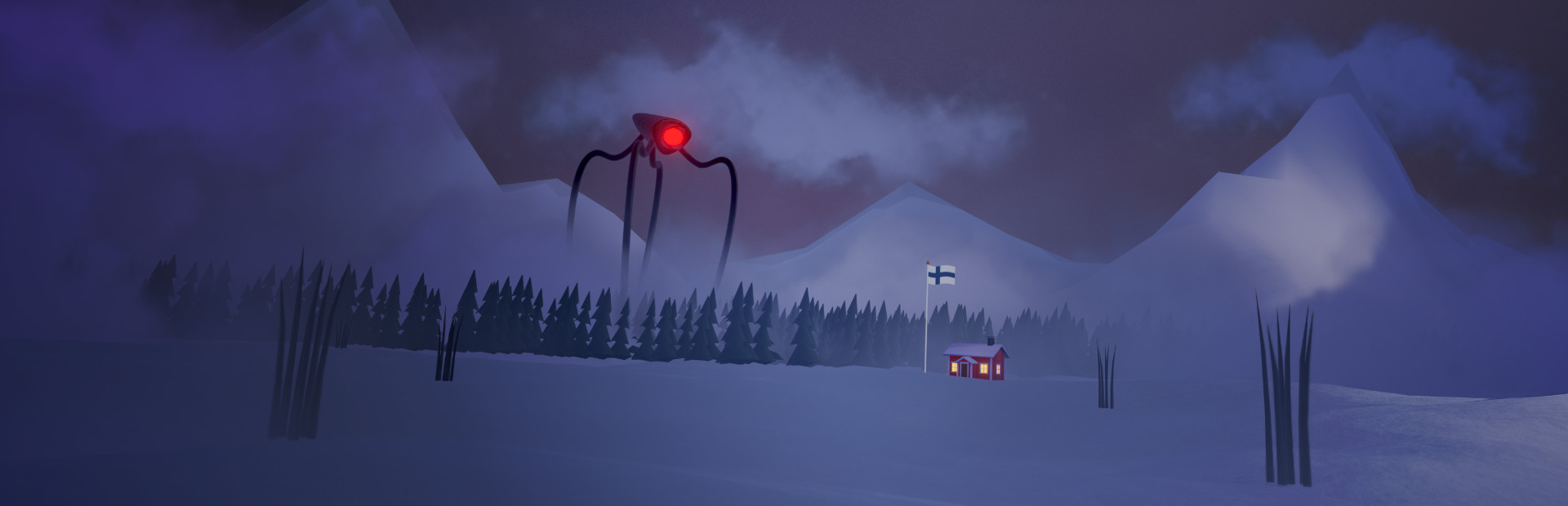
Full ARRIVAL: ZERO EARTH update
Read the full published notes in a cleaner layout. The original post stays linked below.
Repeated intro
Hello All!
What changed
- UI and audio
- Gameplay
- Store
- Maps
ARRIVAL: ZERO EARTH changes
The original goal of this update was not to go so heavy on the UI improvements, but this update ended up being a bigger visual revamp (in terms of UI and Icons).
The UI and Icons have been a bit of an eye-sore in the game and there have been comments about it during and before the early access, but now with this update, I hope things look a little better in the game.
It might take some time to get used to the "new look", but I think things are now more pleasing to the eye.
"Behind the Scenes" the code that handles Unit and Item configurations (and game configurations in general) got a big refactoring that I've wanted to make for a long time, this makes working with the game more pleasant.
Graphical Tweaks
All the icons (units/items) now have mostly the same color scheme as previously, but all icons now have gradients of colors and a few other effects to make them look more pleasing
Some of the icons got slightly tweaked and simplified since some of the icons (for example the assault rifle unit) had too much detail for the small size the icons are shown in.
Most of the Tooltips and Windows now use the dark -background version, I think this makes everything more eye-pleasing and a bit easier to read.
Big Headers for example with windows now use a more "stylized" font. Previously the default font that came with Unity was used, which was probably a bit easier to read, but also a bit boring in general.
All the Building Dialogs got changed into a more "dynamic" layout format, which makes it a little easier to update the texts etc., without worrying the layouts will break.
Update objectives list header
Added shadows and outlines to all fonts
Added shadows for the unit and item icon holders
Tweak fonts in the stats sidebar in the level HUD
The buttons in the main menu got re-arranged (I hope it's not too much of a shock!)
The "Dear Friends/Welcome Text" on the main menu got removed, this was originally added mostly for early playtests and demo versions to communicate with the players (as it's a bit of a pain to communicate on Steam if the game is not released), but now it's nicer to use these posts for communication.
Item Pool Changes
The goal of these changes was to make the item selections in the S-Market a bit more interesting. Now the S-market tries to prioritize showing items that the player has not yet selected.
Item Shops / S-Market try to prioritize showing items that are not yet acquired
Items are removed from the possible item pool if they are shown enough times in S-Market but never selected
Other Changes
Make sticky bombs larger so that they are more noticeable
Show the "Biomes Unlocked" counter on the Start Run dialog
That's it for this update, I hope the game looks a little better now in terms of UI and Icons. Thanks everyone for your support!
jounitus
Source
Changelog.gg summarizes and formats this update. How we read updates.