How do we look? Requirements: - Easy and fast to draw - Easy to animate - Clear and understandable - Era accurate - Cute and charming Step 1) Choose a Perspective It was fairly easy for us to choose it because since we
In this update1
Full notes
Full Untimely Hidden: Patara update
Read the full published notes in a cleaner layout. The original post stays linked below.
What changed
0 fixes2 additions3 changes0 removals
Maps
Gameplay
UI and audio
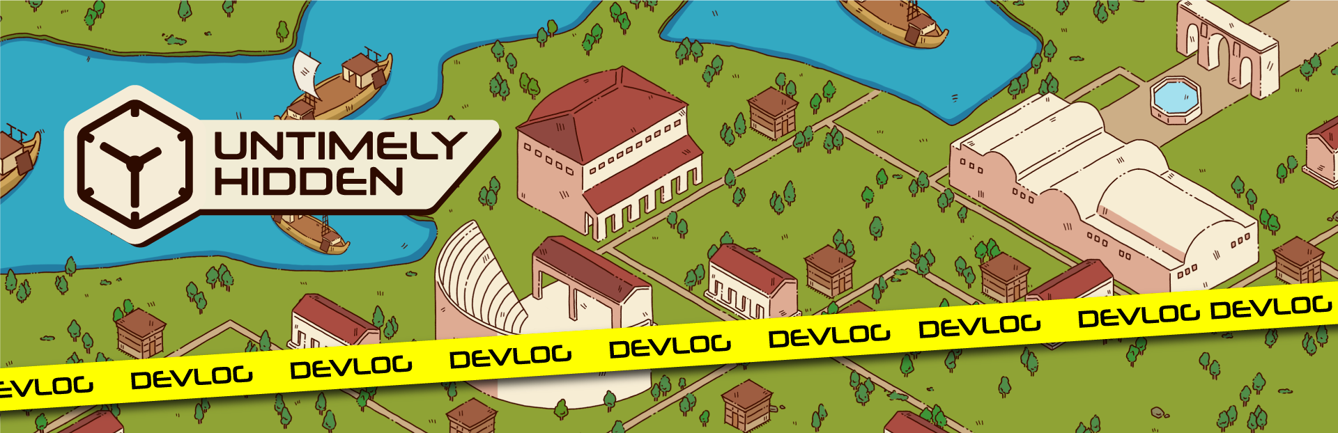
changedHow do we look?It was fairly easy for us to choose it because since we are a small team and I’m the only in-game asset artist, we needed our assets to be reusable, so this immediately eliminated the three-point perspective layout. We could either choose a one-point perspective where we look at the scenery head on or an isometric perspective. Isometric made the most sense since we wanted a large map that is accurate to Patara.
addedHow do we look?This is a hidden object game so our players will be really focused on the screen and search for the objects. To prevent eye strain, we decided to avoid extremely bright and vivid colors, keeping our colors more muted but still lively. So next thing to decide as shading, we tried different shading and texturing methods where our assets were shaded more realistically and had stronger textures. But even though we liked some of the concepts we decided not to use them since it was more time consuming to create assets that way and we need a ton of assets. We also needed to reuse assets and sometimes flip them so that they can fit in different places so harsh lighting with strong contrast would look weird and unnatural when flipped. So we decided to go with simple cell shading where only one plain of the object would get a shadow and we added details and textures with hatch lines.
addedHow do we look?We wanted our characters to be cute, charming and easy to animate. So we made chubby sort of chibi looking characters with big oval eyes and noodle arms. We argued about giving them other facial features aside from just to eyes but adding eyebrows, nose and mouth only took away from their cute childlike innocent looks.
changedHow do we look?We needed a companion to guide us through our journey, give us hints and above all be a pal, so we started working on KronoDex. This somehow became the most dividing subject for the team (i never should’ve shown them all the concepts) no one liked the same design. After we decided on a general concept, we looked for ways to make the KronoDex part of the UI, but this came with its own challenges since we needed it to work not only on pc but also on console and mobile. After we ironed out all the kinks KronoDex took its final form!
changedHow do we look?This was the Lead Artist Batu speaking, in the next DevLog our sound designer Engin will be talking about his side of this adventure.
Untimely Hidden: Patara changes
changedIt was fairly easy for us to choose it because since we are a small team and I’m the only in-game asset artist, we needed our assets to be reusable, so this immediately eliminated the three-point perspective layout. We could either choose a one-point perspective where we look at the scenery head on or an isometric perspective. Isometric made the most sense since we wanted a large map that is accurate to Patara.
addedThis is a hidden object game so our players will be really focused on the screen and search for the objects. To prevent eye strain, we decided to avoid extremely bright and vivid colors, keeping our colors more muted but still lively. So next thing to decide as shading, we tried different shading and texturing methods where our assets were shaded more realistically and had stronger textures. But even though we liked some of the concepts we decided not to use them since it was more time consuming to create assets that way and we need a ton of assets. We also needed to reuse assets and sometimes flip them so that they can fit in different places so harsh lighting with strong contrast would look weird and unnatural when flipped. So we decided to go with simple cell shading where only one plain of the object would get a shadow and we added details and textures with hatch lines.
addedWe wanted our characters to be cute, charming and easy to animate. So we made chubby sort of chibi looking characters with big oval eyes and noodle arms. We argued about giving them other facial features aside from just to eyes but adding eyebrows, nose and mouth only took away from their cute childlike innocent looks.
changedWe needed a companion to guide us through our journey, give us hints and above all be a pal, so we started working on KronoDex. This somehow became the most dividing subject for the team (i never should’ve shown them all the concepts) no one liked the same design. After we decided on a general concept, we looked for ways to make the KronoDex part of the UI, but this came with its own challenges since we needed it to work not only on pc but also on console and mobile. After we ironed out all the kinks KronoDex took its final form!
changedThis was the Lead Artist Batu speaking, in the next DevLog our sound designer Engin will be talking about his side of this adventure.
How do we look?
Requirements:
Easy and fast to draw
Easy to animate
Clear and understandable
Era accurate
Cute and charming
Step 1) Choose a Perspective
It was fairly easy for us to choose it because since we are a small team and I’m the only in-game asset artist, we needed our assets to be reusable, so this immediately eliminated the three-point perspective layout. We could either choose a one-point perspective where we look at the scenery head on or an isometric perspective. Isometric made the most sense since we wanted a large map that is accurate to Patara.
Step 2) Decide on Line Art
We wanted a natural look but since it's a hidden object game we needed our assets to be easily readable so even though not using line art would make it look more natural we decided on using line art. But since we wanted a more natural look, we decided to avoid using line tool to create perfect lines, this would preserve the hand drawn look and make things look flawed and therefore natural. I also decided to break the line art in some places so that it would give more texture to the assets.
Step 3) Colors and Shading
This is a hidden object game so our players will be really focused on the screen and search for the objects. To prevent eye strain, we decided to avoid extremely bright and vivid colors, keeping our colors more muted but still lively. So next thing to decide as shading, we tried different shading and texturing methods where our assets were shaded more realistically and had stronger textures. But even though we liked some of the concepts we decided not to use them since it was more time consuming to create assets that way and we need a ton of assets. We also needed to reuse assets and sometimes flip them so that they can fit in different places so harsh lighting with strong contrast would look weird and unnatural when flipped. So we decided to go with simple cell shading where only one plain of the object would get a shadow and we added details and textures with hatch lines.
Step 4) Characters
We wanted our characters to be cute, charming and easy to animate. So we made chubby sort of chibi looking characters with big oval eyes and noodle arms. We argued about giving them other facial features aside from just to eyes but adding eyebrows, nose and mouth only took away from their cute childlike innocent looks.
Step 5) Companion
We needed a companion to guide us through our journey, give us hints and above all be a pal, so we started working on KronoDex. This somehow became the most dividing subject for the team (i never should’ve shown them all the concepts) no one liked the same design. After we decided on a general concept, we looked for ways to make the KronoDex part of the UI, but this came with its own challenges since we needed it to work not only on pc but also on console and mobile. After we ironed out all the kinks KronoDex took its final form!
And the quest continues….
This was the Lead Artist Batu speaking, in the next DevLog our sound designer Engin will be talking about his side of this adventure.
Thank you all so much for following our journey and supporting us, hope to see you soon! :3