In this update3
Full notes
Full Trackastrophe! update
Read the full published notes in a cleaner layout. The original post stays linked below.
What changed
- Gameplay
- UI and audio
- Maps
Trackastrophe! changes
Once we settled on Trackastrophe’s core concept, it was time to figure out an art direction. But… how do you even start?
As the concept artist, it’s my job (with the other artists) to throw the first ideas on the table and explore what could work. From the beginning, we knew we wanted something very colorful and a little crazy.
We started with the train as our anchor point. It came naturally, everyone instantly knows what a train looks like, and since the game is about guiding something using movement tiles, rails felt like the perfect match for the concept.
Humanizing the train
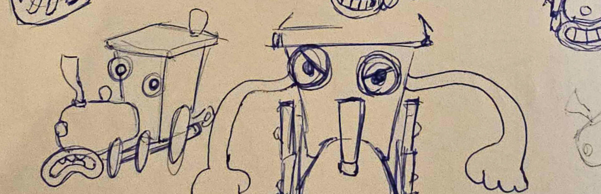
Now the big question: how do you humanize a train?
We really wanted it to have at least some human-like features— eyes and a mouth —so players would instantly connect with it emotionally. I filled my sketchbook with train doodles. Train shapes were way harder to figure out than I expected! There are already so many mechanical parts… so where do you even put a mouth without overcomplicating the design?
At first, I tried putting the whole face on the front of the train, but there are already tons of existing designs like that. So I looked for something more unique. In the end, I used the snowplow/cowcatcher as the mouth!
I even drew a version with a mustache… but the emotions weren’t as readable, so it had to go (RIP moustache train).
Shape language & movement ideas
Next, we simplified the shapes to make the silhouette feel friendlier and easier to read from a distance.
Then came the movement question: Do rails simply appear in front of the train? That felt a bit boring. Do we push the idea further and give it hands and even FEET?? Tough choice, right?
We decided to meet in the middle and give it hands. A train with little grippers was… honestly too cursed. ?
So the idea became: the train actually places rails in front of himself, like the independent little train he is.
Expressions & colors
Finally, I explored different facial expressions to see how he might behave and what kind of animation potential he had.
He looks adorable ! What do you think?
When it came to colors, though, it was painful, everyone had their favorite palette. After a long and dramatic color-scheme war on Miro, we agreed on a simple, bright set that reflects the cozy vibe of the game. It also gives the train a more toy-like feel, which fits perfectly with the biomes we were already working on.
[carousel]
[/carousel]
Aaaah he’s so cute! (Maybe also a tiny bit unsettling… but I can’t help it. I love making cursed things.) Kinoko Studio Lara Social media manager & concept artist
Source
Changelog.gg summarizes and formats this update. How we read updates.