
In this update3
Full notes
Full The Looter update
Read the full published notes in a cleaner layout. The original post stays linked below.
Repeated intro
Hello there, Looters!
What changed
- Gameplay
- Maps
- UI and audio
The Looter changes
It’s been quite some time since the last devlog, but we definitely want to keep you a bit more up to date right until the launch because, well, we are finally getting there!
In this one, the one doing the writing will be me - Łukasz, also known by some by the alias BaldPixelArtist. I want to do a little dive into the art of The Looter and how it evolved during this journey and what this game means to me as an artist.
ENVIRONMENT
Where should we start? Maybe here, with the general environment.
The Looter - as you might recall - is a post-apo game with a lot of platforming/shooting action, and the "post-apo" part is where I could really go hard on the lush forest reclaimed by nature, kind of like The Last of Us but sideways and with a 2D vibe.
This is the earliest iteration of the general look of the game. What I always remember is that I wanted to get that immersive pixel art look, just like in my holy grail of pixel art - Metal Slug. Highly detailed backgrounds where you can often notice limited but well-fitted parallax planes with readable interactive objects that don’t stick out like sore thumbs. Well… I see now how far I was from that. Some solid detail in small spots and muuuuch less when it came to bigger assets, and don’t even get me started on the backgrounds - RANDOM GRADIENT GO! This is when ambition met the lack of skill, to put it bluntly.
At the beginning, we worked in 480x240 native resolution, which still is pretty much a standard for some more retro looking games. Later on we went bigger, because for some reason I felt that resolution was a bit tight - of course that was a lack of experience talking, not knowing the exponential nature of pixel art resolutions. Take a look at the first tries of that level up.
Foliage definitely got a level up in terms of details, but they were still far from what I had in mind. Ground was changed into a tile set instead of ready chunks (reality check), but that gave the blocky Mario-ish vibe that I tried so hard to avoid. Using perspective on said tiles didn’t help either; what was meant to add depth just added a guide for the eyes to follow the rectangular shape.
Forest was always the main biome we wanted to go for. More specifically, it was supposed to be a kind of Soviet-era world overgrown by nature years after being destroyed. I think we maintained that idea pretty well and ended up with good results immersion and atmosphere wise. In the picture above, you can see that we got closer to what we initially planned. The world started to feel natural; layers in the background started to look more natural and added proper depth. Some assets were still unfortunately subpar to what I envisioned, so we needed to reiterate still.
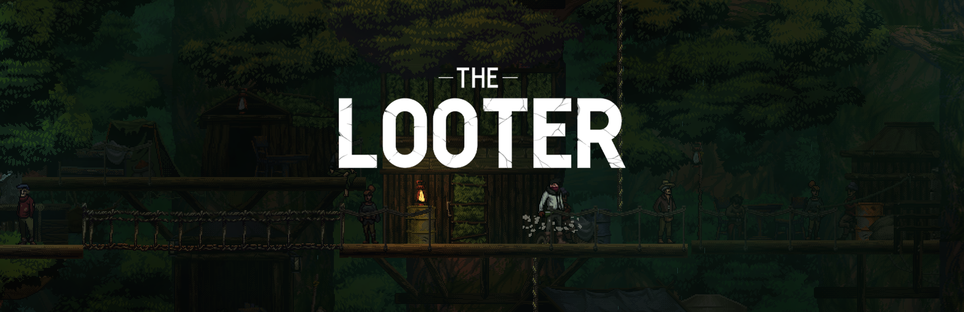
This is where we are at in the current version. Textures were simplified, colors became more saturated, contrasts were improved for visual clarity, and backgrounds became more organic with fogs, lights, and foliage movement added. The ground is pretty straight most of the time still, but the way we started to layer objects, it became much less noticeable. With proper ambience sounds, the environment came to life, and it became the closest to the original vision. At this time, we are very satisfied with how it turned out - the improvements could go on forever, as always, but this is where we put the full stop.
CHARACTERS/ENEMIES/ANIMATIONS
While I consider myself an environment artist first and foremost, and that is where I put most of my workload, as the only dude who does art on our team, I had to tackle animations with no real prior experience. This is where we were at the beginning of the project:
Steam post imageSteam post image
Derpy and clunky animations aside, the designs of the main character were not too readable in the overall dark environment of our game. But the idea for monster designs was there, and we kind of grew attached to this look of the hero. For the needs we had, these animations were enough, but I knew the upgrade was coming, and it did with the resolution expansion.
In this GIF you can see the new design didn’t really change at its core, but the moment I did that white jacket with black fur, I fell in love with it, and I felt it gives our guy a nice pop and flair while keeping that ‘kinda normal dude in a post-apo world’.
While the design was set in stone, the animations themselves have been changed a few times during the development - the example shown in the GIF as well. The main principle I had when working with characters was efficiency. There was no other way but to make some compromises; the animations are not as fluid as in some newer titles - those take absurd amounts of time and were impossible for me to implement considering the workload of the environment art. But I did try to make them as good as possible at the time, as fast as possible, and while some animations might yet get some upgrades, I am mostly content with what I achieved when it comes to both the main character and the monsters.
Some of you may notice that most NPCs, other than talking and some looping animations like a cook slicing something or a butcher butchering larvae, are not animated. Most of the reasons were stated above already, but there was more reason - the more important a character is, the more animations he has, basically. This allowed us to cut time spent on character art but also makes it easier for the player to recognize important people and ones he can and, often, should interact with.
What I believe is that not everything needs to move to make the scene alive - properly used sounds, barks, and even placement of characters may bring life to the scene without unnecessary workload.
UI
Alright, we are close to finishing, and I thought it was fitting to leave the UI for last because, well, it mirrors how I approached it in the game art itself - I kinda dreaded getting down to it, never having been a fan of that kind of work, and I think, weirdly, this piece of design brought the most conflicts in our team for some reason. At the beginning it was pretty aimless, had some basic functionality, but the core mechanics weren’t there and wouldn’t be for quite a long time, so we slapped on some bare minimums and called it a day for now.
As the game progressed visually, we tried to do the same with the UI, as you can see in the screenshot below. One side of the team was pushing the minimalistic approach, with inspirations coming from big titles like Resident Evil. I was never really much of a fan of that style in our case and wanted to go full classic, with pixel art everything (well, other than font) - detailed icons, ornaments, backgrounds, and character art. But considering how much other stuff there was to do, it would just be postponed without end.
But! I think it was October last year when most of the necessary art was finally done and I could tackle my next challenge. So the main problem was the icons I made were too big, kind of. But the thing was… I mostly made all of them already (for previous UI iterations), so I had to brainstorm a lot about how to fit everything I wanted per screen and keep it tidy. Well, once I managed to develop some good looking mockups, I managed to finally persuade the minimalistic side of the studio to my pixel ways.
In the end I had to resize some of the icons, but not many, mostly the ones on the right side of the character art - the accessories. In different places we used clipping masks to keep things tight but still readable.
We crunched a bit with implementing all the elements, and after around 2 months of off and on UI work, we finally ended up with the look you can see below. It was a pretty big milestone and a powerful gust of wind into our sails, to be honest. Seeing a coherent and tidy look really helped with focusing on different aspects of the game that we had left to do and polish.
So, we are approaching the end of my long babble. In the beginning I said that I wanted to mention what the project means to me as an artist. To put it simply, a lot. A crazy lot. Before I started the project, I was meandering and looking for a place in the world, picking up studies at the uni I never had a chance to finish, feeling very lost. Art was kind of there, somewhere in the background, but I’ve never really taken it seriously. When I started making art for The Looter, that pixel art spark that lit up when I was 11 came up, and I could never stop pixeling since. It was a gruesome journey at times with an insane amount of work piling up, tensions in the studio, and the feeling of wanting to throw it all away. But we kept going and pushed through. Now we are coming close to the finish line. During almost a decade of relentless pixel pushing, I’ve acquired skills I would never have if it weren't for The Looter. That little guy in the white jacket gave me a career, for which I can never be grateful enough.
If you managed to get through to the end, thank you so much!
Cheers!
Source
Changelog.gg summarizes and formats this update. How we read updates.