Repeated intro
Hello hello beautiful people, today we'll talk about UI and other small improvements made to the game over the last few weeks and the challenges that came with them.
What changed
0 fixes1 addition5 changes0 removals
changedHello hello beautiful people, today we'll talk about UI and other small improvements made to the game over the last few weeks and the challenges that came with them.
changedFirst off, UI. When we did playtesting some time ago, people were asked to give feedback on different aspects of the game, like its visuals, its audio, its 'funness' and... the UI. The UI had the lowest score, I think it was around 5/10. UI is notoriously difficult to get right because people have different preferences and standards. For example, some prefer less UI for better immersion, others prefer more UI (buttons, info pannels etc). And then don't get me st arted on style. Some prefer a transparent UI, others solid, others a more old-school approach where each UI element is designed to look like it's part of the game theme (this is my preference).
changedThis is not a trivial problem. I believe it's going to take some time before the game finds what works best for it. For now at least, I did change the way the main menu looks, mainly because of first impressions reasons. Instead ofa black background, there will now be a sequence of 'videos' playing. These 'videos' bring both nice in-game visuals and audio to the main menu. I use quotes because they're not technically videos. Though anybody who will play this game will see those as background videos like you see in other popular games like DSP. Video files have the disadvantage of taking up a lot of memory, gpu power and disk space. Especially if you've got 5 30s clip videos at 60fps. That's 2GB of disk space. That's not a big deal considering it's just the main menu and nothing else is happening anyway, so this is the first approach I tried.
changedBut I soon discovered a more important problem: The game engine's video api fails to run these 60fps videos properly (stutters) if your pc is a potato. So I looked into including 30 fps versions of each video. Not only did this double the size on disk to 4GB, but it's like applying a bandaid to a problem. It's not a real solution. Ultra wide monitors would still have black edges. At this point, after about a week of video editing and programming, it became clear to me that playing video files is the wrong approach. So how can we have an animated background in the main menu that's both visually stunning on any monitor, comes with sounds and is as efficient as it gets?
addedOther UI changes include a title in the main menu and more tooltips: hovering over combat entities shows a bunch of combat related info like damage amount or damage type, armor and attack rate. Worker bays also show their config on their tooltips. All swarm buildings that produce creep now have their creep production displayed as well.
changedThat's about it for the UI for now and maybe for a while. The goal here is not to make a perfect UI that everyone loves, rather to make the game fun and enjoyable. If the UI conveys the information required, then it would have achieved its purpose.
Swarmdustry changes
changedHello hello beautiful people, today we'll talk about UI and other small improvements made to the game over the last few weeks and the challenges that came with them.
changedFirst off, UI. When we did playtesting some time ago, people were asked to give feedback on different aspects of the game, like its visuals, its audio, its 'funness' and... the UI. The UI had the lowest score, I think it was around 5/10. UI is notoriously difficult to get right because people have different preferences and standards. For example, some prefer less UI for better immersion, others prefer more UI (buttons, info pannels etc). And then don't get me st arted on style. Some prefer a transparent UI, others solid, others a more old-school approach where each UI element is designed to look like it's part of the game theme (this is my preference).
changedThis is not a trivial problem. I believe it's going to take some time before the game finds what works best for it. For now at least, I did change the way the main menu looks, mainly because of first impressions reasons. Instead ofa black background, there will now be a sequence of 'videos' playing. These 'videos' bring both nice in-game visuals and audio to the main menu. I use quotes because they're not technically videos. Though anybody who will play this game will see those as background videos like you see in other popular games like DSP. Video files have the disadvantage of taking up a lot of memory, gpu power and disk space. Especially if you've got 5 30s clip videos at 60fps. That's 2GB of disk space. That's not a big deal considering it's just the main menu and nothing else is happening anyway, so this is the first approach I tried.
changedBut I soon discovered a more important problem: The game engine's video api fails to run these 60fps videos properly (stutters) if your pc is a potato. So I looked into including 30 fps versions of each video. Not only did this double the size on disk to 4GB, but it's like applying a bandaid to a problem. It's not a real solution. Ultra wide monitors would still have black edges. At this point, after about a week of video editing and programming, it became clear to me that playing video files is the wrong approach. So how can we have an animated background in the main menu that's both visually stunning on any monitor, comes with sounds and is as efficient as it gets?
addedOther UI changes include a title in the main menu and more tooltips: hovering over combat entities shows a bunch of combat related info like damage amount or damage type, armor and attack rate. Worker bays also show their config on their tooltips. All swarm buildings that produce creep now have their creep production displayed as well.
First off, UI. When we did playtesting some time ago, people were asked to give feedback on different aspects of the game, like its visuals, its audio, its 'funness' and... the UI. The UI had the lowest score, I think it was around 5/10. UI is notoriously difficult to get right because people have different preferences and standards. For example, some prefer less UI for better immersion, others prefer more UI (buttons, info pannels etc). And then don't get me st arted on style. Some prefer a transparent UI, others solid, others a more old-school approach where each UI element is designed to look like it's part of the game theme (this is my preference).
This is not a trivial problem. I believe it's going to take some time before the game finds what works best for it. For now at least, I did change the way the main menu looks, mainly because of first impressions reasons. Instead ofa black background, there will now be a sequence of 'videos' playing. These 'videos' bring both nice in-game visuals and audio to the main menu. I use quotes because they're not technically videos. Though anybody who will play this game will see those as background videos like you see in other popular games like DSP. Video files have the disadvantage of taking up a lot of memory, gpu power and disk space. Especially if you've got 5 30s clip videos at 60fps. That's 2GB of disk space. That's not a big deal considering it's just the main menu and nothing else is happening anyway, so this is the first approach I tried.
But I soon discovered a more important problem: The game engine's video api fails to run these 60fps videos properly (stutters) if your pc is a potato. So I looked into including 30 fps versions of each video. Not only did this double the size on disk to 4GB, but it's like applying a bandaid to a problem. It's not a real solution. Ultra wide monitors would still have black edges. At this point, after about a week of video editing and programming, it became clear to me that playing video files is the wrong approach. So how can we have an animated background in the main menu that's both visually stunning on any monitor, comes with sounds and is as efficient as it gets?
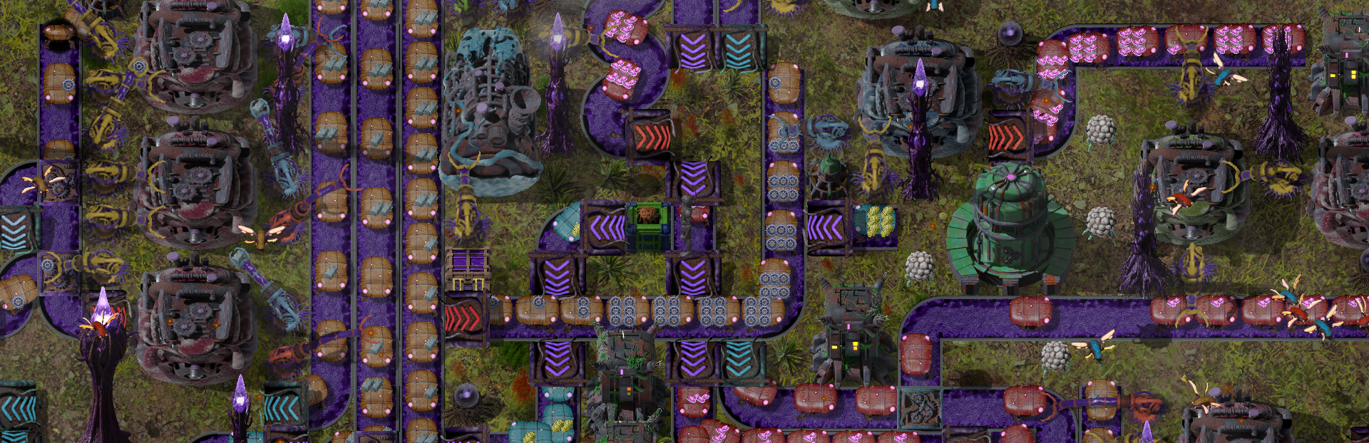
Enter scripting magic: Pop an actual in-game factory into existence and let it run while disabling player interaction. One way to achieve this for example is to load up an existing premade savefile. Another way is to build the factory from script and configure it in a meaningful way to provide a good visual experience. I chose to go with the second approach as it is future proof even if it is more dev work. Loading a factory from file in future game versions or while the game is still under heavy development may break and require adjustments, and what dev wants to deal with that?
Other UI changes include a title in the main menu and more tooltips: hovering over combat entities shows a bunch of combat related info like damage amount or damage type, armor and attack rate. Worker bays also show their config on their tooltips. All swarm buildings that produce creep now have their creep production displayed as well.
That's about it for the UI for now and maybe for a while. The goal here is not to make a perfect UI that everyone loves, rather to make the game fun and enjoyable. If the UI conveys the information required, then it would have achieved its purpose.
In other news, playtesting should open up again sometime in the next 2 weeks. I'll be announcing it on discord so if you're reading this and are not part of it and want to try out the demo, and maybe leave some feedback, make sure you join the discord!
Happy gaming!