Update log
Full Stardeus update
The complete published notes, normalized for clean reading and source attribution.
Extracted changes
- UI and audio
- Gameplay
So, we've heard a lot of feedback when it comes to the new UI!
Mostly it's been about people being afraid it will be less complicated than the old UI, taking away some of Stardeus charm… We hear your words loud and clear, but rest assured we're here to showcase before and after pictures so everyone can get a better idea of what is changing and how it's going to evolve.
Make sure to read also to get a better understanding of what we want to highlight in each screenshot. Also remember it’s still a work in progress, and things might subject to change.
Main Menu
Before:
After:
A major change when it comes to the main menu is that it will use your last saved game as a backdrop. And also; clicking Continue will let you play right away – seamlessly.
Settings Menu
Before:
After:
Main menu settings have been merged with the in-game settings menu, so they will have the same settings available. It has also been reorganised and had huge improvements to readability. Some settings that used to be exclusive to the main menu are now also available in-game and can be applied instantly instead of having to reload your save file.
UI Themes
The new UI allows you to change colours to your heart’s content! A highly requested feature, and you can create your own themes too.
UI Scaling
Just like the old UI it will support dynamic scaling and font sizing. Focus has also been put on lower resolutions like the Steam Deck (1280x800) & some UI elements will have different versions and arrangements depending on the screen size for easier gameplay.
Game View
Before:
After:
The old game view had nearly 50 visible buttons in the main screen at all times and could at times be very cluttered and frustrating for new players. Veterans who’s gotten used to it for years liked it for the information it granted so that is something we wanted to be careful about not changing all too much.
The new game view focuses on clarity and minimalism with high signal to noise ratio.
TLDR: Less buttons you never use and more information at a glance.
Selected Being
Before:
After:
In the old UI when you selected a being it was condensed into a single panel. Although this was information dense, it could also be very hard to understand what was clickable and not. In the new UI all types of information has been reorganised into tabs & all actions you can perform has been moved into the bottom of the screen.
Notification Hub
Before:
After:
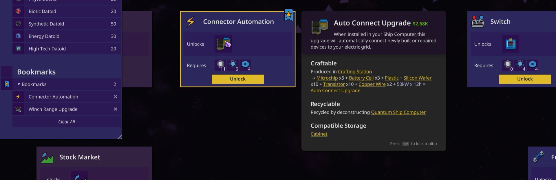
We noticed how the notification hub became something players usually just ignored after a while of playing, adding to the UI fatigue. We’ve addressed this in the new notification hub with the number of notifications and an icon of the most important notification showing at a glance. Expanding hub gives you a list sorted by importance. The expandable list makes it easier to drill into the details of each notification. For instance, previously we needed a separate UI for listing devices that lacked materials, but now it’s built straight into the notification hub.
Inventory
Before:
After:
The new inventory is a lot easier to navigate! The categories are easier to read & configuring the favourites list (renamed to
Source