Now that I’m back from GDC – the Game Developers Conference, where I had a lot of fun showing Puzzle Spy International at an indie showcase event at Syzygy in San Francisco – it’s back to work on the game!
Full notes
Full Puzzle Spy International update
Read the full published notes in a cleaner layout. The original post stays linked below.
What changed
0 fixes1 addition3 changes0 removals
Events
UI and audio
Maps
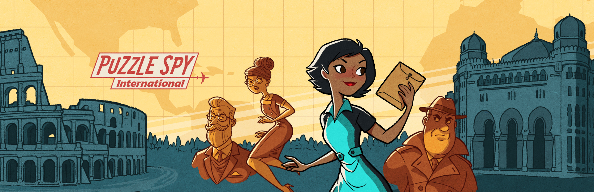
addedNow that I’m back from GDC – the Game Developers Conference, where I had a lot of fun showing Puzzle Spy International at an indie showcase event at Syzygy in San Francisco – it’s back to work on the game! This past month, we’ve been playtesting, adding coding to one of the newer puzzles, creating layout art for another new puzzle, working out how to save games mid-puzzle, and lots of drawing, including two new backgrounds (location: Classified!) and three new characters. As I’m adding all of this art, this seems like a fitting time to talk about the art inspirations for PSI.
changedAs I’m fond of telling folks, the story is set in the mid-sixties and so is the art and UI design. I’ve been drawing heavily on the illustration style from the middle of the last century for this project, often referred to as “mid-century modern.” United Productions of America was an animation studio that was big in the 50s, and their work was heavily influenced by graphic design. Walt Disney films of the period had a great graphic sense as well, with ‘101 Dalmatians’ (1961) being a particular influence on my backgrounds for PSI. Many look at the art from the game and remark that it reminds them of 90’s and early 2000’s animation, like work by Craig McCracken (Powerpuff Girls, Foster’s Home for Imaginary Friends, Wander Over Yonder) and Genndy Tartakovsky (Dexter’s Laboratory, Samurai Jack.) McCracken and Tartakovsky attended CalArts together, where some of the instructors were animators from UPA and both ended up drawing influences from UPA’s animation… So it’s not a coincidence, we’re just all inspired by the same earlier work!
changedI’m also drawing a lot of inspiration from other graphic design of the 50s and 60s, including fonts and logos from that period, maps, magazine illustrations, movie posters, and package design. Saul Bass, well known for creating movie titles and posters at that time, is also a great reference for 60s imagery. I’ve also tried to absorb some ideas from contemporary artists whose work pays homage to the mid-century look, including Shane Glines, Derek Yaniger, Kevin Dart, and especially Satoshi Hashimoto.
changedSo that’s where the art style of Puzzle Spy International comes from, as well as a not-insignificant helping of my OWN art style, having been a professional illustrator and creating art, animation and UI for games for several decades. I hope you like what you’ve seen so far!
Puzzle Spy International changes
addedNow that I’m back from GDC – the Game Developers Conference, where I had a lot of fun showing Puzzle Spy International at an indie showcase event at Syzygy in San Francisco – it’s back to work on the game! This past month, we’ve been playtesting, adding coding to one of the newer puzzles, creating layout art for another new puzzle, working out how to save games mid-puzzle, and lots of drawing, including two new backgrounds (location: Classified!) and three new characters. As I’m adding all of this art, this seems like a fitting time to talk about the art inspirations for PSI.
changedAs I’m fond of telling folks, the story is set in the mid-sixties and so is the art and UI design. I’ve been drawing heavily on the illustration style from the middle of the last century for this project, often referred to as “mid-century modern.” United Productions of America was an animation studio that was big in the 50s, and their work was heavily influenced by graphic design. Walt Disney films of the period had a great graphic sense as well, with ‘101 Dalmatians’ (1961) being a particular influence on my backgrounds for PSI. Many look at the art from the game and remark that it reminds them of 90’s and early 2000’s animation, like work by Craig McCracken (Powerpuff Girls, Foster’s Home for Imaginary Friends, Wander Over Yonder) and Genndy Tartakovsky (Dexter’s Laboratory, Samurai Jack.) McCracken and Tartakovsky attended CalArts together, where some of the instructors were animators from UPA and both ended up drawing influences from UPA’s animation… So it’s not a coincidence, we’re just all inspired by the same earlier work!
changedI’m also drawing a lot of inspiration from other graphic design of the 50s and 60s, including fonts and logos from that period, maps, magazine illustrations, movie posters, and package design. Saul Bass, well known for creating movie titles and posters at that time, is also a great reference for 60s imagery. I’ve also tried to absorb some ideas from contemporary artists whose work pays homage to the mid-century look, including Shane Glines, Derek Yaniger, Kevin Dart, and especially Satoshi Hashimoto.
changedSo that’s where the art style of Puzzle Spy International comes from, as well as a not-insignificant helping of my OWN art style, having been a professional illustrator and creating art, animation and UI for games for several decades. I hope you like what you’ve seen so far!
Now that I’m back from GDC – the Game Developers Conference, where I had a lot of fun showing Puzzle Spy International at an indie showcase event at Syzygy in San Francisco – it’s back to work on the game! This past month, we’ve been playtesting, adding coding to one of the newer puzzles, creating layout art for another new puzzle, working out how to save games mid-puzzle, and lots of drawing, including two new backgrounds (location: Classified!) and three new characters. As I’m adding all of this art, this seems like a fitting time to talk about the art inspirations for PSI.
As I’m fond of telling folks, the story is set in the mid-sixties and so is the art and UI design. I’ve been drawing heavily on the illustration style from the middle of the last century for this project, often referred to as “mid-century modern.” United Productions of America was an animation studio that was big in the 50s, and their work was heavily influenced by graphic design. Walt Disney films of the period had a great graphic sense as well, with ‘101 Dalmatians’ (1961) being a particular influence on my backgrounds for PSI. Many look at the art from the game and remark that it reminds them of 90’s and early 2000’s animation, like work by Craig McCracken (Powerpuff Girls, Foster’s Home for Imaginary Friends, Wander Over Yonder) and Genndy Tartakovsky (Dexter’s Laboratory, Samurai Jack.) McCracken and Tartakovsky attended CalArts together, where some of the instructors were animators from UPA and both ended up drawing influences from UPA’s animation… So it’s not a coincidence, we’re just all inspired by the same earlier work!
I’m also drawing a lot of inspiration from other graphic design of the 50s and 60s, including fonts and logos from that period, maps, magazine illustrations, movie posters, and package design. Saul Bass, well known for creating movie titles and posters at that time, is also a great reference for 60s imagery. I’ve also tried to absorb some ideas from contemporary artists whose work pays homage to the mid-century look, including Shane Glines, Derek Yaniger, Kevin Dart, and especially Satoshi Hashimoto.
So that’s where the art style of Puzzle Spy International comes from, as well as a not-insignificant helping of my OWN art style, having been a professional illustrator and creating art, animation and UI for games for several decades. I hope you like what you’ve seen so far!