Full notes
Full OCTOPinbs update
Read the full published notes in a cleaner layout. The original post stays linked below.
What changed
- Gameplay
OCTOPinbs changes
An Interview with the Development Team Behind OCTOPinbs
【Developer Q&A: Art Edition】
We’re excited to share a Q&A-style interview with the development staff at Tri-Ace, the team behind OCTOPinbs.
In this Art Edition, we talk with the game’s designer about character concepts, visual direction, and the design philosophy that shaped the game.
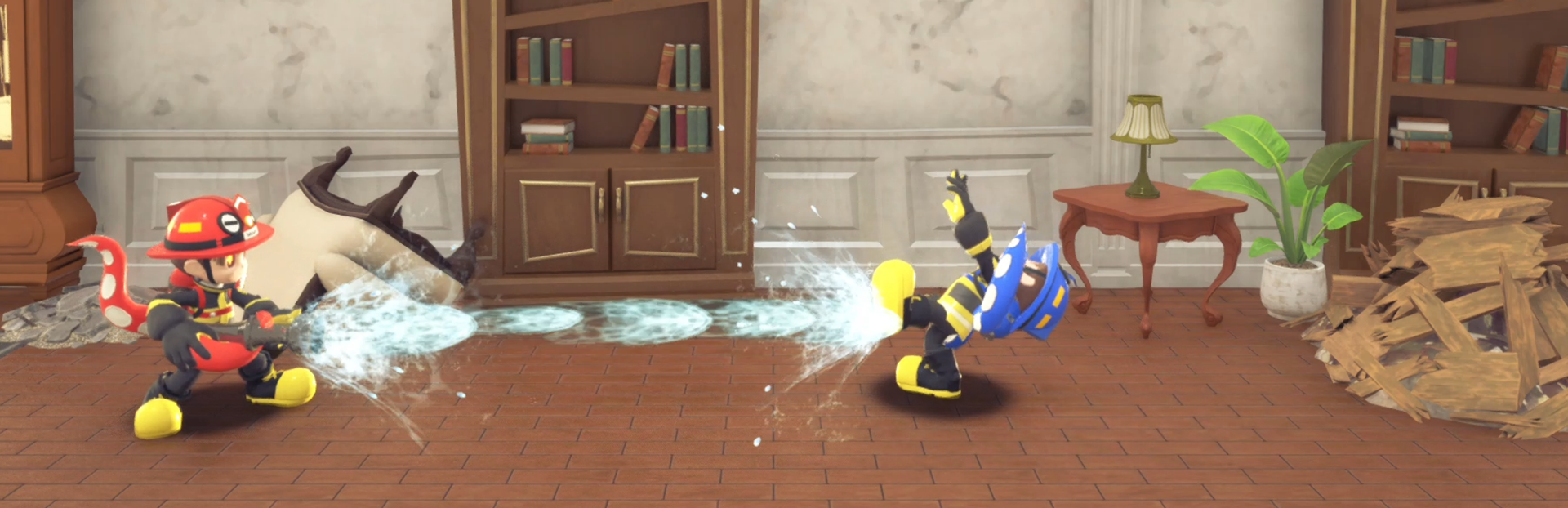
Q1. The characters in this game have a very bright, friendly, and pop-style design.
What was the intention behind choosing this visual direction, and what was the core concept?
Since this game revolves around fire, we wanted to avoid letting the inherent fear of the theme become too strong. That’s why we chose an overall visual style that feels pop and approachable.
Also, because OCTOPinbs is designed as a multiplayer experience, we felt that characters with smaller, more deformed proportions work better than realistic, tall characters. They create a sense of liveliness and visual density on screen, which helps emphasize that “everyone is playing together” party-game feeling.
At the same time, the game includes deception as a core gameplay element. So instead of making the characters simply “cute,” we added striking elements—such as octopus tentacles growing from the characters, and the idea that the human body itself is just a vessel—to make them more memorable and impactful.
Q2. In a game where players “identify others through action,
” what aspects of character motion or silhouette did you focus on most?
In terms of animation, although the game shares the tense atmosphere typical of social deduction games—where players are constantly suspicious of one another—we intentionally incorporated many comical movements, to be easier to think, “Let’s play one more round,” after each match.
For the gameplay of identifying roles, we paid special attention to making the movements of Firefighters and Artists clearly contrast with each other. We exaggerate those differences so that even when peeking from behind a wall, players can tell who is who just by their silhouette.
Q3. The game features two factions: Firefighters and fire-wielding Artists, with the Artists having especially unique settings. Were there specific design choices you focused on for each role?
One of the main keywords we value throughout the entire game is “contrast.” This applies very strongly to the Firefighters and the Artists.
Firefighters are widely recognized as heroes and symbols of justice, so we aimed for a classic, straightforward design that feels friendly and easily accepted by anyone. In contrast, the Artists were designed with slightly taller proportions and more slender silhouettes, creating a completely opposing visual impression.
We even applied this contrast to subtle details like the eyes, so that the difference in personality could be felt at every level. For the Artists in particular, we didn’t want them to feel like simple villains. Instead, we designed them as characters who follow their own sense of justice and beliefs—making them feel cool and compelling in their own way.
Both characters are very dear to us.
Q4. As a social deduction game with many players moving around the screen at once, what did you do to ensure players don’t lose track of their own character and can clearly understand the situation?
This was one of the areas we spent the most time adjusting. Originally, we started with 10 color variations, but we more than doubled that number so players would have more options to enjoy.
However, that also meant some colors became quite similar, making it harder to tell characters apart. To solve this, we repeatedly checked how distinguishable each color was during actual gameplay and fine-tuned the hues little by little.
If there’s one thing we did, it was checking everything over and over again as a team. It was definitely a very hands-on approach.
Q5. Finally, is there any specific detail or point you’d especially like players to pay attention to across all characters?
This game is packed with the designers’ passion and ideas. We constantly shared concepts and refined them until the very end, asking ourselves how we could make the game even more fun.
For example, each enemy monster has its own unique personality, so simply watching their movements and designs can be enjoyable. We also put a lot of thought into making it immediately clear where fire can be set among the many objects in the environment.
Even though fire is a core theme, we didn’t want it to feel too frightening—so we were especially careful with the visual effects used when Artists ignite flames.
If I had to ask players to look at just one thing… Honestly, I’d like you to look at everything. That’s how much heart and effort the whole team poured into this game!!
Source
Changelog.gg summarizes and formats this update. How we read updates.