Full notes
Full Mossfield Origins update
Read the full published notes in a cleaner layout. The original post stays linked below.
What changed
- UI and audio
- Gameplay
Mossfield Origins changes
Good afternoon Future Residents,
A reminder that the Kitfox 10th Anniversary Sale is on for two more days. All our games are on sale, so don't miss out! This week's update shows off the visual upgrades we've beamed down to the planet. Even the textual elements are more clear. Read the full brief:
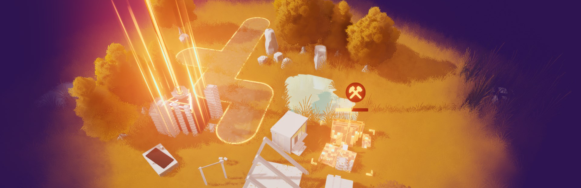
Build Detail
The building progress visualization module has been installed for Residents which helps clarify status (and just looks cool).
Text legibility
Previous text display for the mission suffered some artifacts when rendered without high quality settings, and had issues with certain fonts and languages.
We redid all the text visualization to look crisp and clean at any quality or resolution (view the image below full size). We also implemented ways to share all the format and styles across the mission display such that we can change it in one spot and have everything update (e.g for user configurable text scaling and accessibility later).
Tech details ahead: Text previously was decent (msdf), but is now using the latest MTSDF form for best quality and scaling - if you're curious it looks like giant colorful blobs of letters before being shown!
Lighting display
A little more tech related details on "how to fix the muddy colors and make them look better" by fixing the tone mapping.
For a small bit of history, when I started this project I implemented it as a blank void where I played with environment lighting. The left hand side was the default exposure for the environment, the right side is the exposure turned all the way up. I thought it looked a lot nicer, and continued to add grass, and then a whole game...
Along the way I must have had trouble with the look and for some reason hardcoded an extra "undo that exposure please" into the global display outcome (not a good idea!). This was kinda ruining all the colors, squashing them.
Once I noticed it, I realized all the colors, color grading, and tone mapping were based around this invalid setup. That meant redoing the look from the bottom up, making sure all the colors come through as intended, and just LOOK at the difference ✨
It's not that the game looked bad, but when compared with the new one and what I had intended visually, you can see how flat and muddy it was in comparison.
Bonus points
With all the colors cleaned up, I also added a debanding pass which smooths out all the gradients and colors and makes everything really satisfying.
Wishlist and follow the game - Follow the developer / and the publisher! - Sign up for the newsletter - Join the Discord
From your friendly developer Ruby, and friends at Kitfox Tanya + Alexandra.
Source
Changelog.gg summarizes and formats this update. How we read updates.