
In this update4
Full notes
Full Drive Beyond Horizons update
Read the full published notes in a cleaner layout. The original post stays linked below.
What changed
- Gameplay
- Maps
- Balance
- UI and audio
Drive Beyond Horizons changes
Dear Drivers,
A few months ago, we refreshed the visual identity of Drive Beyond Horizons. This included a brand-new logo, a complete overhaul of our Steam page visuals, updated marketing assets, and a more consistent visual identity across every platform where the game is presented.
We thought it would be interesting to take a step back and highlight the work our artists have done behind the scenes. Today is the perfect opportunity to show you a little more of the creative process behind this redesign.
Disclaimer: We'd like to address something we've seen mentioned a few times. Work on the game's visual identity does not slow down development in any way. Artists and graphic designers are not the people programming gameplay features, fixing bugs, or developing new content. Updating the game's branding happens in parallel with development and doesn't take resources away from it.
A New Logo for Drive Beyond Horizons
After more than a year with our previous logo, we had naturally grown attached to it. It represented the game well during its early stages, but over time it became clear that it no longer met all of our needs.
While it looked good in certain situations, it hadn't originally been designed to work consistently across every medium. Effects such as the glow and the large number of colors often reduced its readability depending on where it was displayed, whether on Steam, social media, thumbnails, or smaller formats.
Our objective wasn't to reinvent the identity of the game, but to refine it and make it more durable.
To achieve this, we established a few key goals:
Preserve the overall atmosphere and personality of Drive Beyond Horizons.
Stay recognizable and avoid moving too far away from the original logo.
Improve readability across all sizes and marketing materials.
Create a complete family of logo variations that remain instantly recognizable.
This redesign wasn't limited to the main logo. We also revisited the icon, created multiple logo variations, and redesigned all of our marketing assets to build a more cohesive visual identity across every platform.
Below, you can see some of the exploration boards created during the design process. These show different directions, concepts, and i terations we explored before arriving at the final version.
Reimagining the Steam Page
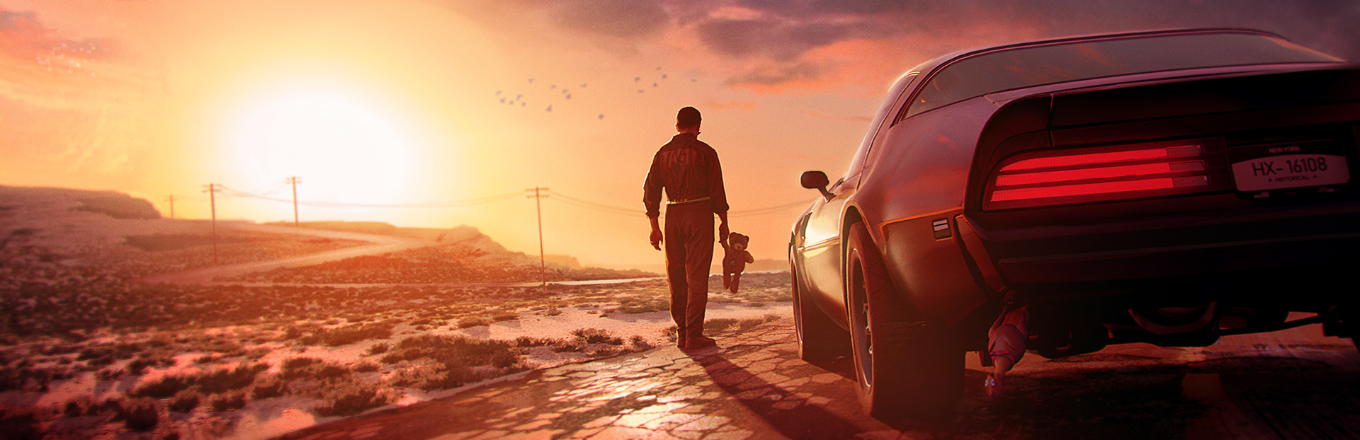
Alongside the new logo, we also completely redesigned the visuals used across the Steam page, including: the main capsule, the horizontal capsule, and the vertical capsule.
The goal was to create a stronger and more unified visual identity while giving the game's presentation a fresh new look. We wanted something more artistic and impactful, without losing what makes Drive Beyond Horizons unique: its energy, sense of adventure, and fun.
The process began with a series of black-and-white composition studies focusing on some of the game's most iconic vehicles. These early concepts allowed us to experiment with framing, movement, and visual balance before committing to a final direction.
Once the strongest compositions had been selected, they were further developed into fully illustrated key arts. Particular attention was given to creating dynamic scenes that would immediately communicate the spirit of the game while remaining clear and recognizable across Steam's different formats.
The final visuals are the result of a collaboration between Maël, who created the illustrations and concept art, and Basile, who handled the final graphic treatment. This included the color grading inspired by DBH's signature pink identity, the integration of the redesigned logo, and the overall polish needed to ensure a consistent visual language across every marketing asset.
Below, you'll find the final artworks that were considered, and ultimately selected, for the Steam page.
A Brand-New Press Kit
One thing quickly became obvious throughout this rebranding effort: it was time for Drive Beyond Horizons to have a proper press kit.
Whether you're a journalist, content creator, or simply someone looking to showcase the game, having easy access to high-quality, up-to-date resources makes a real difference.
With that in mind, we put together a complete press kit featuring everything needed to present Drive Beyond Horizons in its current form. It includes official artwork, logos and their different variations, screenshots, key visuals, game information, and other graphical resources that can be freely used when covering the game.
Our goal was simple: make it as easy as possible for anyone interested in talking about Drive Beyond Horizons to access consistent, high-quality assets.
The Press Kit is now available on our website, and we'll continue updating it as the game evolves.
We hope you enjoyed this behind-the-scenes look at our visual rework and branding process. It’s always a pleasure to share this kind of insight with you and to give a bit more context on how Drive Beyond Horizons continues to evolve beyond the game itself.
Next time, we’ll be going a step further and diving into what’s coming next for the project, with a brand-new series focused on the future of development. Stay tuned.
You might also want to check out:
Our previous patch: PATCH NOTE: 7 NEW VEHICLES ↗
Our official Drive Beyond Horizons 2026 Roadmap (Updated) ↗
Source
Changelog.gg summarizes and formats this update. How we read updates.