
In this update1
Full notes
Full Don't Forget the Phone update
Read the full published notes in a cleaner layout. The original post stays linked below.
What changed
- Gameplay
Don't Forget the Phone changes
In Don’t Forget the Phone, the Walkie Talkie is one of your nightly tasks. Your job? Relay the secret code back to its mysterious sender. But making it look and feel right took some iteration. Let’s break it down:
The initial version was all about getting the basic functionality working. This Windows-logo-looking version was a quick mock-up that did its job, but I knew it needed something more in the future.
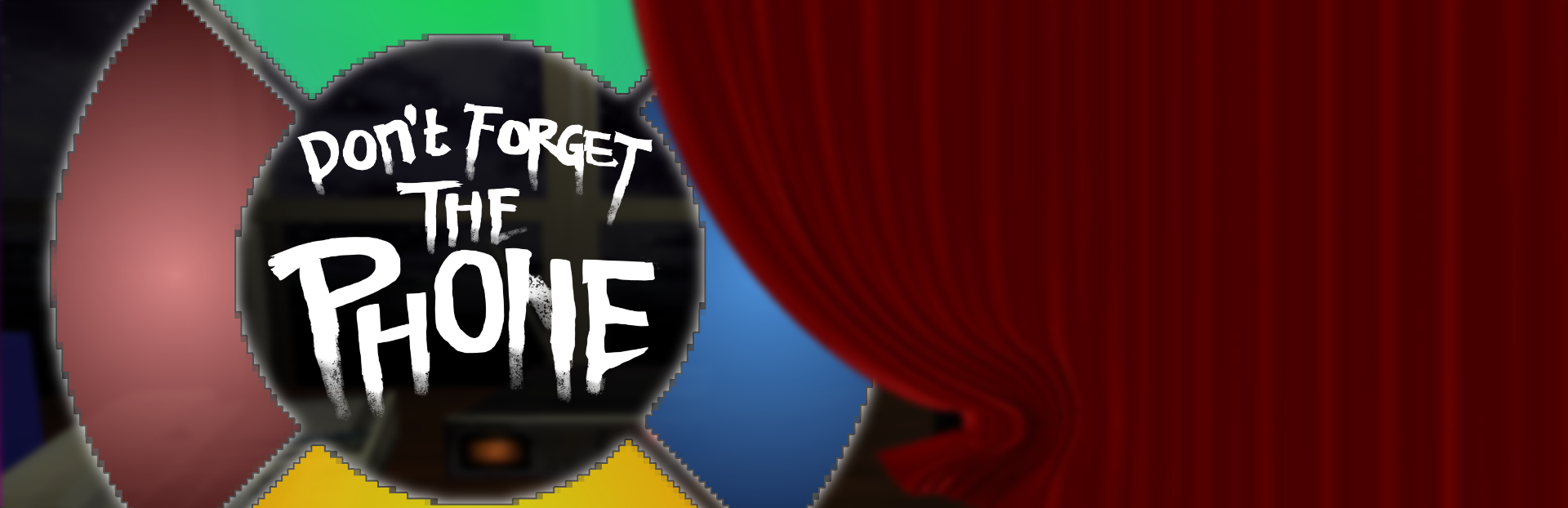
For the final version, I really liked how that old Simon Says toy looked with the circular style that lights up:
I wanted to make something similar. Here is the first mock-up:
Pretty basic, but you can see the vision, right? From here, I wanted to add some depth; make it look more alive and less like an oversimplified corporate logo.
This came next:
Better, but something about it felt off. It almost seems too clean. The game's artstyle mimics PSX/N64 era graphics and this was just way too high-res.
After some more iteration and messing around, I finally settled on this design:
I feel it blends perfectly with the game's environment, and can't wait for you to get your hands on it!
What do you think? Let me know in the comments!
Until next time, —Jaxkey
Source
Changelog.gg summarizes and formats this update. How we read updates.