HomeGamesUpdatesPricingMethodology
Steam News15 April 20262mo ago

New look, same drill!

If you played the Desktop Driller demo, you probably noticed the UI had a certain... intensity to it. Bright colors, sharp contrasts, everything competing for your attention in a 236×340px (or 1.5x, 2x, etc) window.

In this update3

Full notes

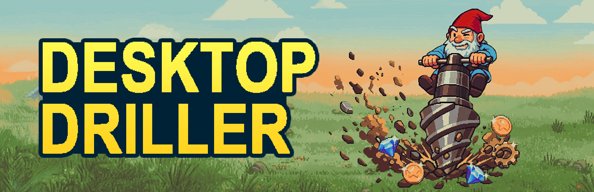
Full Desktop Driller update

Read the full published notes in a cleaner layout. The original post stays linked below.

What changed

0 fixes3 additions3 changes0 removals
  • UI and audio
  • Gameplay
  • Balance
changedIf you played the Desktop Driller demo, you probably noticed the UI had a certain... intensity to it. Bright colors, sharp contrasts, everything competing for your attention in a 236×340px (or 1.5x, 2x, etc) window. It worked, technically. But it didn't feel right.
addedA new paletteI threw out the old colors and built a new palette from scratch. 10 colors total, all with softer, warmer tones. Think less arcade cabinet, more cozy companion. The kind of thing that blends in with your desktop wallpaper instead of fighting it.
changedA new paletteI wanted something you could glance at all day without it getting on your nerves. The palette covers the whole UI (shop, prestige, collection, skill tree) and it just holds together better now. Less visual noise overall.
addedLight and dark modeThis one was long overdue. You can now switch between a light and a dark theme. If you play during the day with a bright desktop, light mode fits right in. Late night session? Dark mode keeps things easy on the eyes.
changedLight and dark modeIt's not just an inverted palette, I tuned both modes separately so they each feel right on their own. Same 10 colors, different balance.
addedWhy now?Give the new look a try and tell me what you think. Does it feel better on your desktop? I'm curious to hear.

Desktop Driller changes

changedIf you played the Desktop Driller demo, you probably noticed the UI had a certain... intensity to it. Bright colors, sharp contrasts, everything competing for your attention in a 236×340px (or 1.5x, 2x, etc) window. It worked, technically. But it didn't feel right.
addedI threw out the old colors and built a new palette from scratch. 10 colors total, all with softer, warmer tones. Think less arcade cabinet, more cozy companion. The kind of thing that blends in with your desktop wallpaper instead of fighting it.
changedI wanted something you could glance at all day without it getting on your nerves. The palette covers the whole UI (shop, prestige, collection, skill tree) and it just holds together better now. Less visual noise overall.
addedThis one was long overdue. You can now switch between a light and a dark theme. If you play during the day with a bright desktop, light mode fits right in. Late night session? Dark mode keeps things easy on the eyes.
changedIt's not just an inverted palette, I tuned both modes separately so they each feel right on their own. Same 10 colors, different balance.

If you played the Desktop Driller demo, you probably noticed the UI had a certain... intensity to it. Bright colors, sharp contrasts, everything competing for your attention in a 236×340px (or 1.5x, 2x, etc) window. It worked, technically. But it didn't feel right.

A few of you told me exactly that. The feedback from demo players was clear: the game sits on your desktop for hours, it should feel comfortable to look at, not like a neon sign in the corner of your screen.

So I redesigned the whole thing.

A new palette

I threw out the old colors and built a new palette from scratch. 10 colors total, all with softer, warmer tones. Think less arcade cabinet, more cozy companion. The kind of thing that blends in with your desktop wallpaper instead of fighting it.

I wanted something you could glance at all day without it getting on your nerves. The palette covers the whole UI (shop, prestige, collection, skill tree) and it just holds together better now. Less visual noise overall.

Light and dark mode

This one was long overdue. You can now switch between a light and a dark theme. If you play during the day with a bright desktop, light mode fits right in. Late night session? Dark mode keeps things easy on the eyes.

It's not just an inverted palette, I tuned both modes separately so they each feel right on their own. Same 10 colors, different balance.

Why now?

Honestly? Because players asked. Some of the most useful demo feedback wasn't about mechanics or progression, it was about how the game looked while sitting on screen for hours. That's the kind of thing you don't notice when you're deep in development, but it matters a lot when the game is meant to be a quiet presence on your desktop.

It feels a lot better to me now, but I'm biased.

Give the new look a try and tell me what you think. Does it feel better on your desktop? I'm curious to hear.

And if you're enjoying the game, a rating or a comment goes a long way. It really helps other people find the project. Same goes for suggestions: if something feels off or you have ideas, drop a comment. That's literally how this update happened.

Desktop Driller team

Source

Steam News / 15 April 2026

Open original post

Changelog.gg summarizes and formats this update. How we read updates.