
HomeGamesUpdatesPricingMethodology
Steam News29 September 20232y ago

Office UI Improvement

Game testing is always fun for me seeing how people process all of the little details of the game.

Full notes

Full Defense of Nations update

Read the full published notes in a cleaner layout. The original post stays linked below.

What changed

0 fixes0 additions3 changes0 removals
  • UI and audio
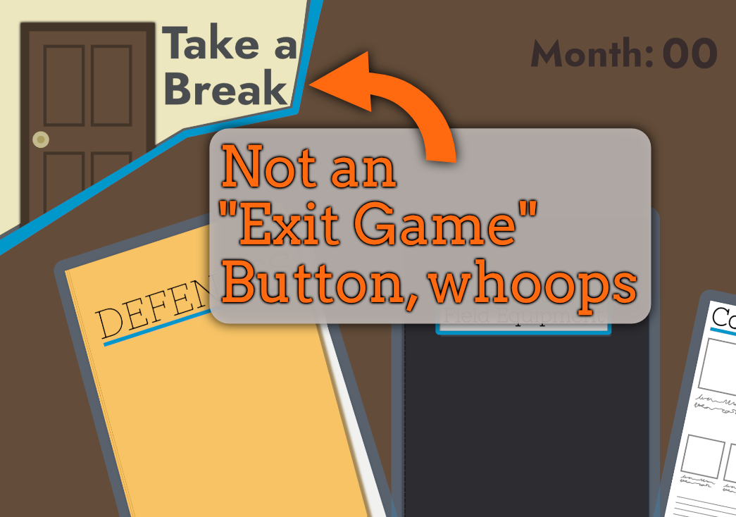
changedNow here with Defense of Nations I've discovered a fairly major oversight that should have been pretty obvious when I made it: People having been missing half the game thanks to my wording of the "Exploration" button😅
changedSo that's been improved, along with some changes to bring the menu border colors in-line with the rest of the UI and the mouse navigation of the Exploration Menu should be less finicky as the "zones" for determining which element the mouse is on have been cleaned up.
changedAs much as I like non-square UI elements, they sure are a pain to make work right with your average UI system.

Defense of Nations changes

changedNow here with Defense of Nations I've discovered a fairly major oversight that should have been pretty obvious when I made it: People having been missing half the game thanks to my wording of the "Exploration" button😅
changedSo that's been improved, along with some changes to bring the menu border colors in-line with the rest of the UI and the mouse navigation of the Exploration Menu should be less finicky as the "zones" for determining which element the mouse is on have been cleaned up.
changedAs much as I like non-square UI elements, they sure are a pain to make work right with your average UI system.

Game testing is always fun for me seeing how people process all of the little details of the game. In a 2D platformer I worked on in college, it was eye opening to discover how many people had difficulty jumping over a box at the start because of how I implemented jumping (no air-control; WASD controls).

Now here with Defense of Nations I've discovered a fairly major oversight that should have been pretty obvious when I made it: People having been missing half the game thanks to my wording of the "Exploration" button😅

So that's been improved, along with some changes to bring the menu border colors in-line with the rest of the UI and the mouse navigation of the Exploration Menu should be less finicky as the "zones" for determining which element the mouse is on have been cleaned up.

As much as I like non-square UI elements, they sure are a pain to make work right with your average UI system.

Source

Steam News / 29 September 2023

Open original post

Changelog.gg summarizes and formats this update. How we read updates.