
In this update4
Full notes
Full 螺钉与浮城 Bolt & Whalington update
Read the full published notes in a cleaner layout. The original post stays linked below.
Repeated intro
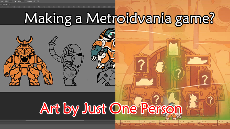
Hello everyone! I’m Bread, the producer of Bolt & Whalington — and also the game’s lead artist (which, to be honest, just means I’m the only artist on the team). A lot of players have asked why we chose a hand-drawn look, so today I’d like to share the story behind our art direction.
What changed
- Balance
- Gameplay
- Maps
螺钉与浮城 Bolt & Whalington changes
For a metroidvania, art is a huge part of the experience, but it also comes with a certain expectation of scale: you need a lot of content. Since our team is small, I thought carefully about art style from the beginning. We needed something that could deliver enough variety and atmosphere without demanding extreme precision for every asset, while still looking appealing at a glance. A hand-drawn style fit that balance well.
With a one-artist team like ours, it’s simply unrealistic to draw ultra-smooth, frame-by-frame animation for everything — the workload would be enormous. If I tried to do that, Hollow Knight ’s “third game” might be out before I finished our art assets.
So our approach is more practical: we use solid base colors and simple shapes to communicate ideas, add detail with broken/fragmented strokes, and keep the outlines strongly hand-drawn rather than obsessing over perfect smoothness. It’s faster to produce, and it also gives the silhouettes a sharper rhythm.
About our color direction
You may have noticed that compared to many metroidvanias on the market, our palette is brighter, rather than leaning heavily into dark tones.
Personally, I don’t think “dark” or “bright” should be a goal on its own. Color exists to serve two purposes:
Support the worldbuilding.
Clearly separate regional themes across the map.
Bolt & Whalington takes place on the Whalington, a massive skyborne fortress-city. That naturally includes many open-air areas, and the atmosphere is designed to lean into a more fantastical feeling. Those conditions don’t really support a game made mostly of dark indoor scenes.
Early areas use brighter tones; as Bolt travels deeper into the Whalington and begins to uncover hidden conspiracies, the environments gradually shift darker. Later on, once the “Floating Isles” map is unlocked, we also introduce outdoor scenes with overcast skies and storms.
Color identity by region
I use a distinct color identity for each region. Strong, high-contrast palettes help reinforce the theme of an area and make it easier to remember.
● Sewers (rats’ territory): a dim, grimy earthy yellow that feels dirty and claustrophobic.
● Agricultural Area: reddish browns inspired by soil and farmland, warmer and more grounded.
● Cabin sections: a vivid orange-yellow that suggests machinery, heat, and energy.
● Residential District: cooler, rain-soaked blues that feel damp and a bit melancholic.
A practical reason we keep things bright
There’s also a production reason for keeping the overall palette fairly bright: it’s a bit of a shortcut for building clear regional identity.
If everything is dark, you often have to rely on ambient light, point lights, emissive objects, and extra effects to communicate color themes. That adds a lot of VFX and level-dressing work — and for a small team, that’s a compromise we simply have to make.
About transitions between areas
Some players have mentioned that transitions between areas can feel abrupt compared to other games, since we don’t always have dedicated “in-between” scenes.
The good news is that this doesn’t require entirely new assets — it’s mostly about blending elements from two adjacent regions. I plan to do this once most of the art resources are finished, but for now it isn’t the highest priority.
If you’d like to learn more about our development process or the thinking behind our design, feel free to leave a comment. I’ll share updates from time to time.
That’s it for this devlog — see you in the next one!
Source
Changelog.gg summarizes and formats this update. How we read updates.