Update log
Full Whisper Mountain Outbreak update
The complete published notes, normalized for clean reading and source attribution.
Extracted changes
- UI and audio
- Gameplay
- Balance
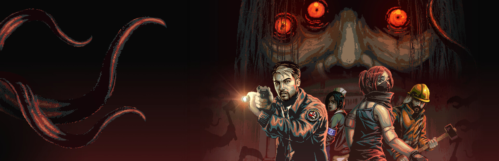
Reporting in, Agents.
We’re back with the latest updates from the B.R.I.M. Support Division.
This week, we're taking a look at some changes we've made on the help our agents proceed with caution. From navigating the environment more smoothly, improving the player HUD, to streamlining lobby access-many of these adjustments were shaped by community feedback and internal playtesting.
Kriswin, the supervising artist of Whisper Mountain Outbreak, will be answering a few questions about the changes made to the game. Refining the UI is an important step for us to create a better gameplay experience, whether you're a veteran agent or a rookie agent.
The importance of UI / UX for the players
UI/UX plays a huge role in how players experience the game. A well-designed UI/UX will help players understand what’s going on. It helps you navigate into the game without confusion. In a tense survival horror game like Whisper Mountain Outbreak, where every second matters, having a clean and responsive interface makes a big difference.
We also wanted the interface to feel like something that supports the immersion rather than breaking it. That’s why we took the time to refine it, ensuring it feels intuitive, easy to read, and fitting the game’s horror vibe.
Main Menu
OLD NEW
Options
OLD NEW
What consideration was put to change the UI / UX ?
At first, I designed the UI with a military-inspired theme. Bold, solid visuals with a worn, metallic look to reflect strength and structure, which I felt suited the game's intense survival atmosphere. But as development went on, I realized that this approach had some drawbacks: the UI elements were too big and lacked transparency, which blocked important parts of the screen and made the gameplay feel cluttered and distracting.
So I shifted to a more minimalist UI, focusing on transparent zones, simple outlines, and silhouette icons to make the screen clearer and less cluttered. I also moved away from the military look and went for a mystery-investigator vibe that fits better with the game’s secret agency theme. Choosing a typewriter-style font helped add a subtle retro-horror feel that supports the tone we wanted.
With the new UI, the screen feels much more comfortable to look at. It doesn’t block key visual cues, and the overall mood is more immersive. Mystery and horror are now felt more strongly through the interface itself. I believe this change not only improved usability but also helped support the storytelling and tone of the game.
Lobby Game (HQ)
OLD NEW
Mission Selection
OLD NEW
What is the most important thing in creating UI / UX?
For me, the most important thing in creating UI/UX is clarity. Making sure players get the information they need without confusion, especially in the middle of intense gameplay. It has to be easy to read, quick to understand, and not get in the way of the action.
But beyond that, it also needs to support the game's tone and atmosphere. Since Whisper Mountain Outbreak is a survival horror game with a strong mystery element, the UI had to feel like part of that world, subtle, eerie, and immersive. So it's a balance between function and feeling: helping players while also deepening their connection to the game’s world.
Ingame
OLD NEW
Transition Loading
OLD NEW
The most significant changes of the UI/UX been made?
The most significant change we
Source